Template for In-App
A template for In-App is the content displayed inside a mobile app through placements. The template is configured for the In-App channel and created in the block editor. The template content can also be defined manually: as custom HTML or in the JSON format.
Block editor
The template is assembled visually from ready-made elements: content is dragged into the editing area and configured without writing code.
When creating a template, select the In-App type — the format in which content is displayed in the app:
- Fullscreen — full-screen display.
- Modal — a modal window.
- Slideup — a panel sliding up from the bottom.
- Floating bar — a floating bar.
- Code editor — opens the code editor with HTML, CSS and JS options.
For the Fullscreen, Modal, Slideup and Floating bar types, the editor provides ready-made starter templates that can be used as a basis.
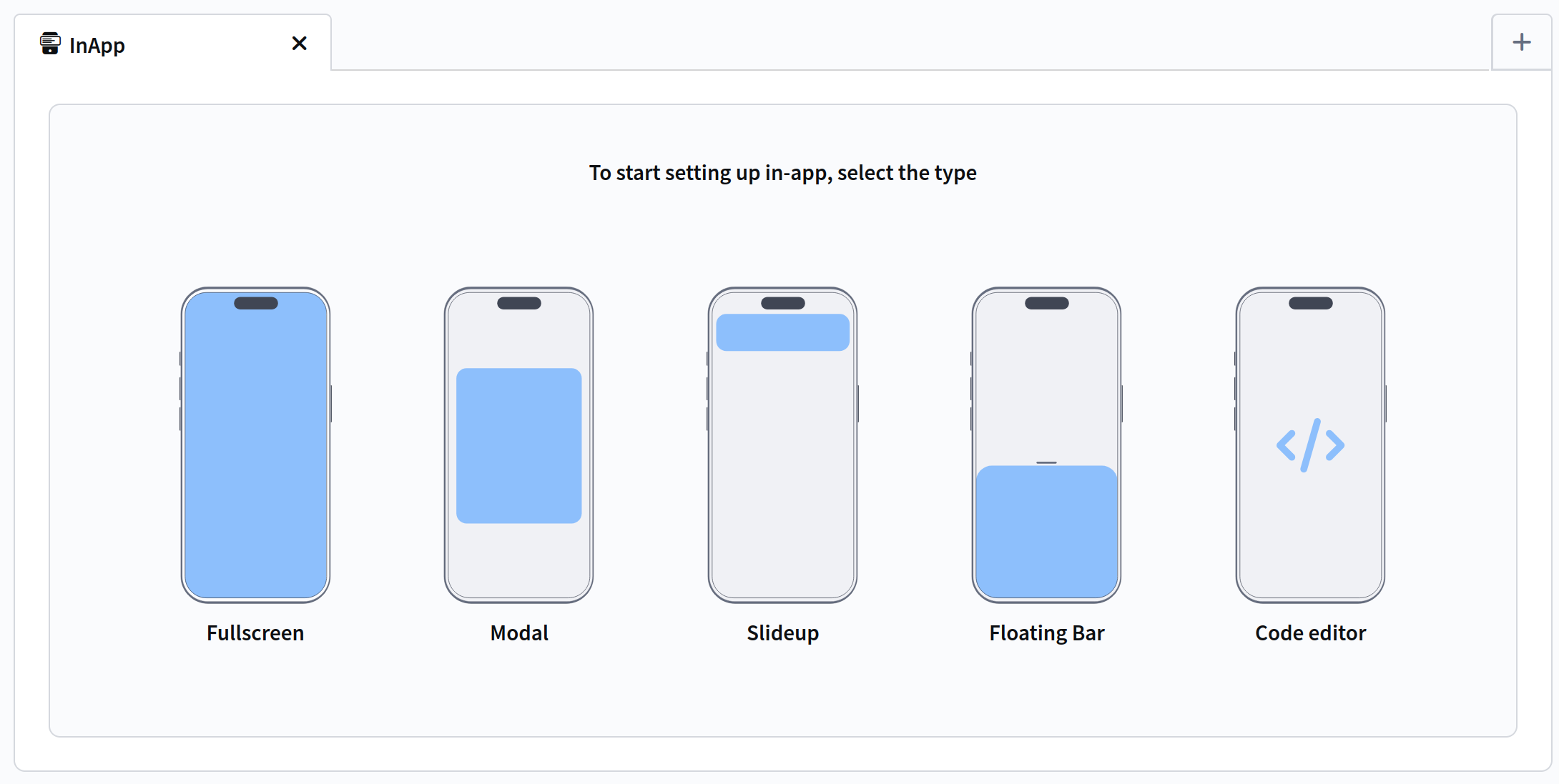
After selecting a placement type, the block editor opens.
Pages and blocks
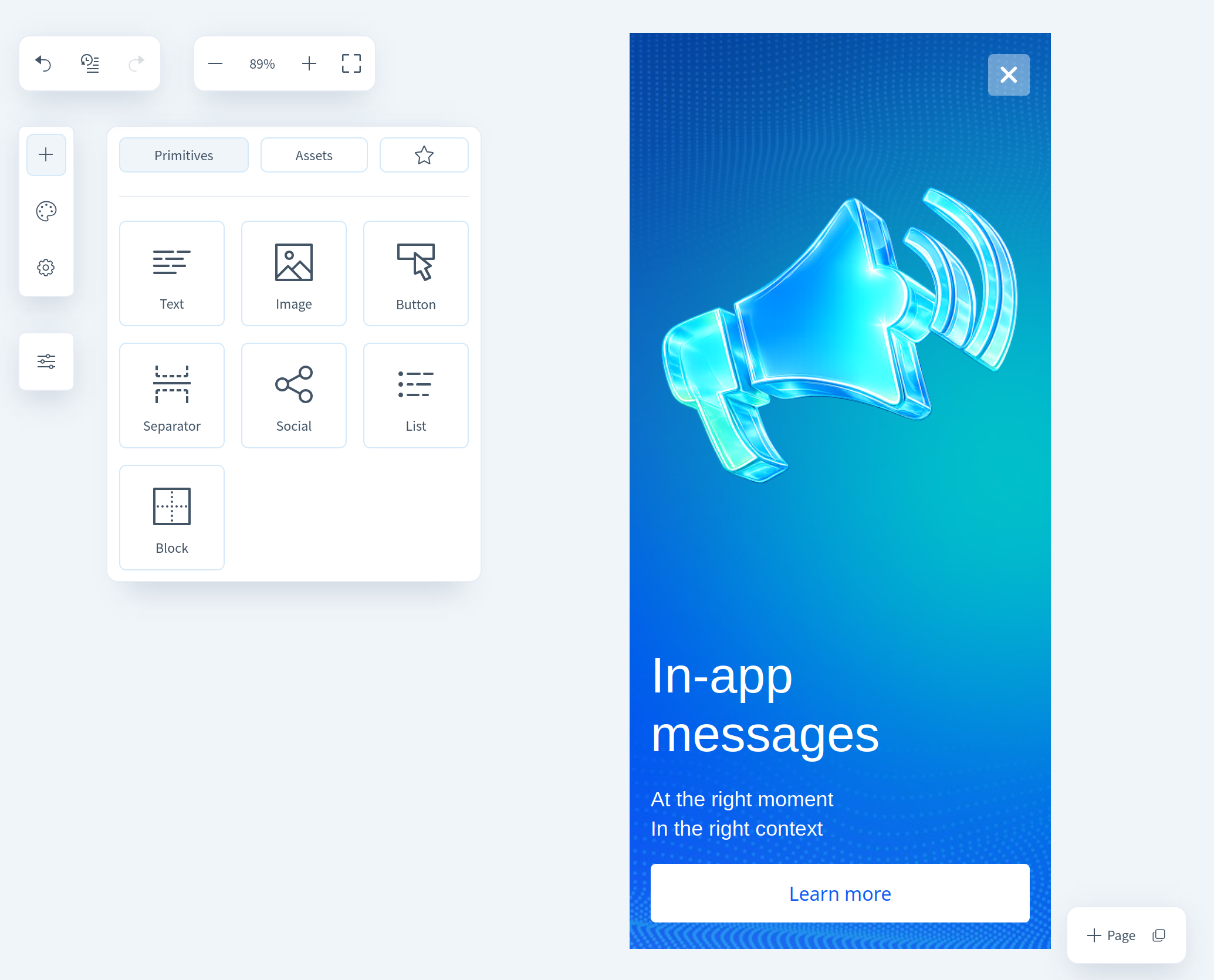
An In-App template can consist of one or more pages between which the user switches in the app. You can copy or add an empty page, as well as switch between pages using the buttons in the bottom right corner of the editor. Each page is divided into blocks and columns that contain content elements.
Blocks and elements
Block
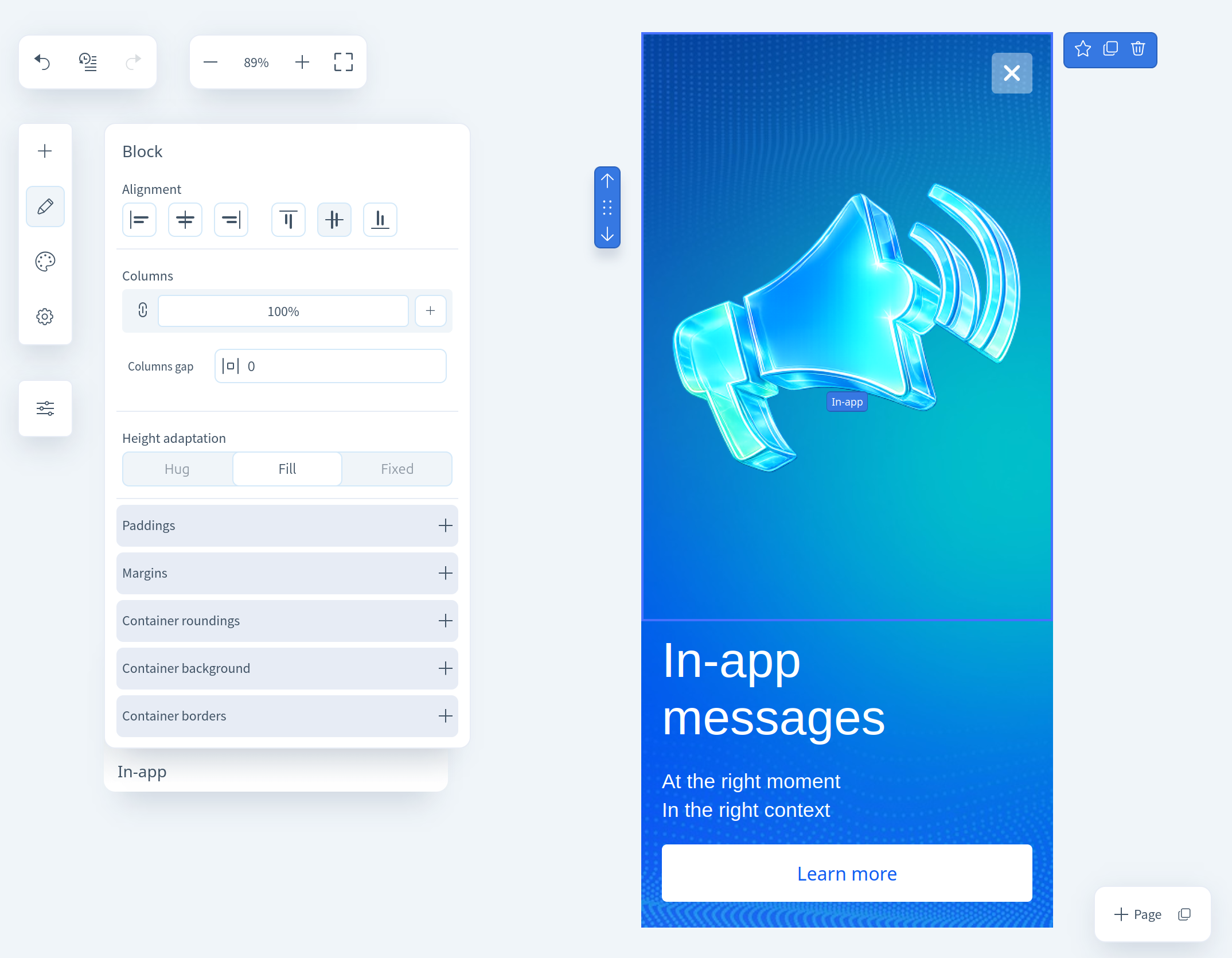
For a content block, the following parameters can be configured:
- Alignment — alignment of the block to the left, right, or center of the template.
- Columns — set the number of columns, their width, and spacing.
- Adaptation — available if the block has more than one column. Defines how the columns appear on mobile: shrink in size or stack vertically, maintaining size.
- Direction of stacking — sets the column order if vertical stacking is selected.
- Paddings — inner spacing between block content and its borders.
- Margins — outer spacing between the block's borders and the template layout.
- Container roundings — controls corner rounding.
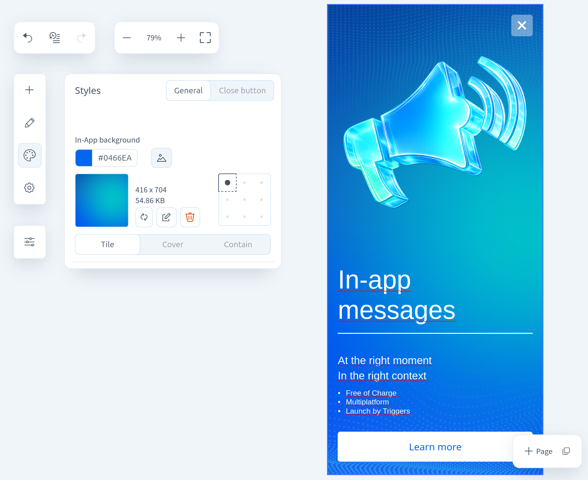
- Container background — choose a background color or upload an image.
- Container border — set the color, thickness, and border style.
You can add content to an empty block by clicking the respective icons inside the element:
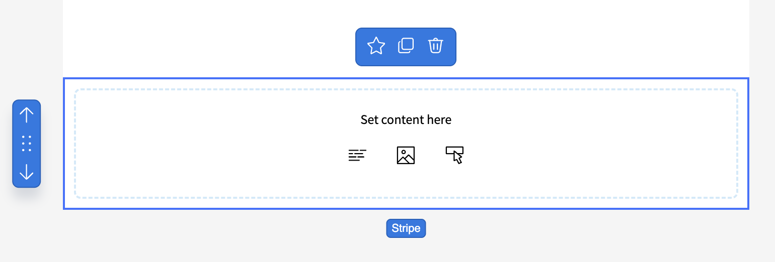
Column properties can also be customized:
- Alignment;
- Padding;
- Column background;
- Column rounding;
- Column border;
- Column size.
For the row containing the block, you can configure:
- Alignment;
- Background;
- Content width;
- Content rounding;
- Content borders;
- Padding.
Some row parameters affect the appearance of the entire template.
Text
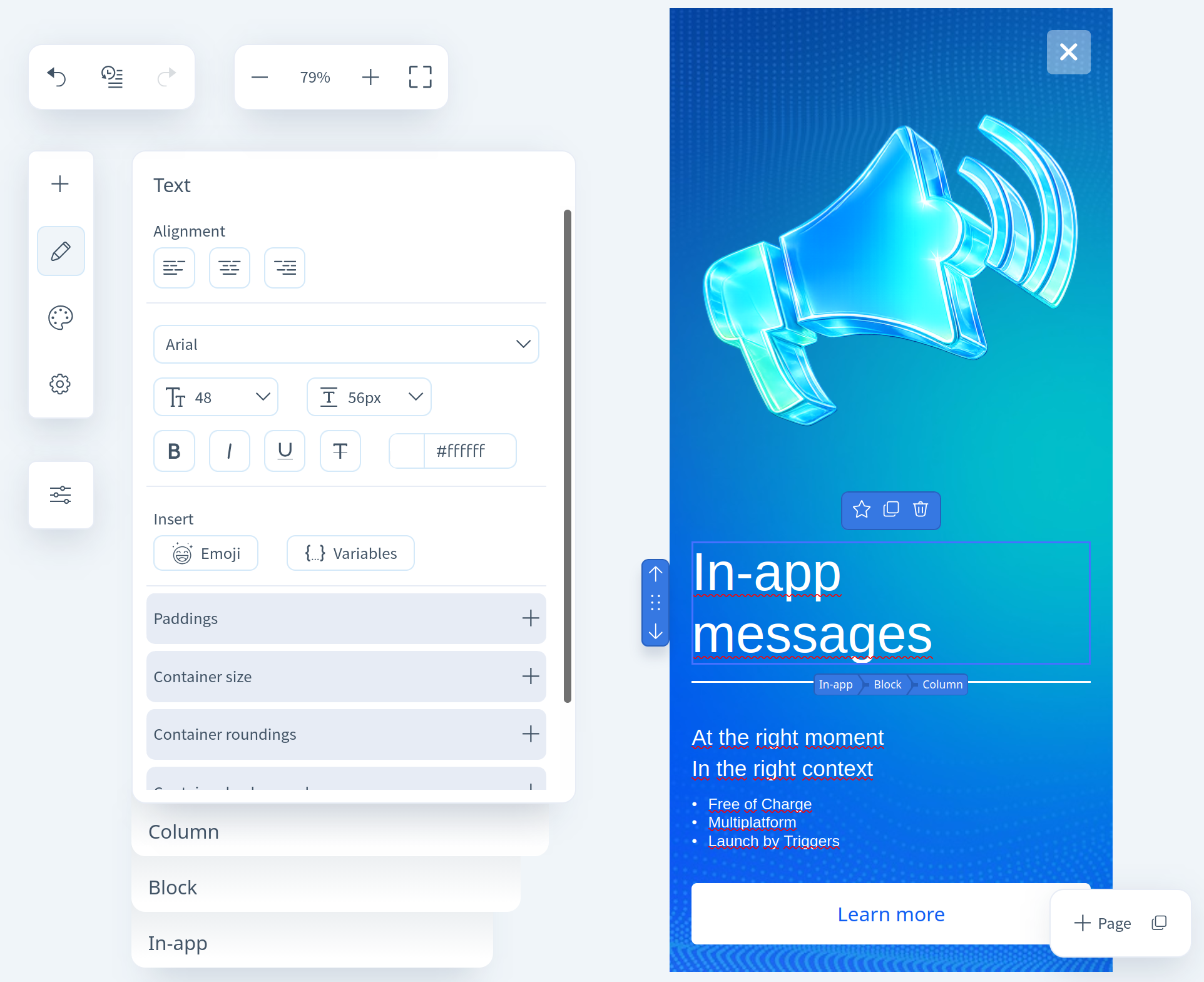
Configurable properties for a text block:
- Alignment of text within the container;
- Font, size, style, and color;
- Insertion of emojis and variables;
- Insert links in text;
- Padding inside the block;
- Size, rounding, background, and border of the container;
Image
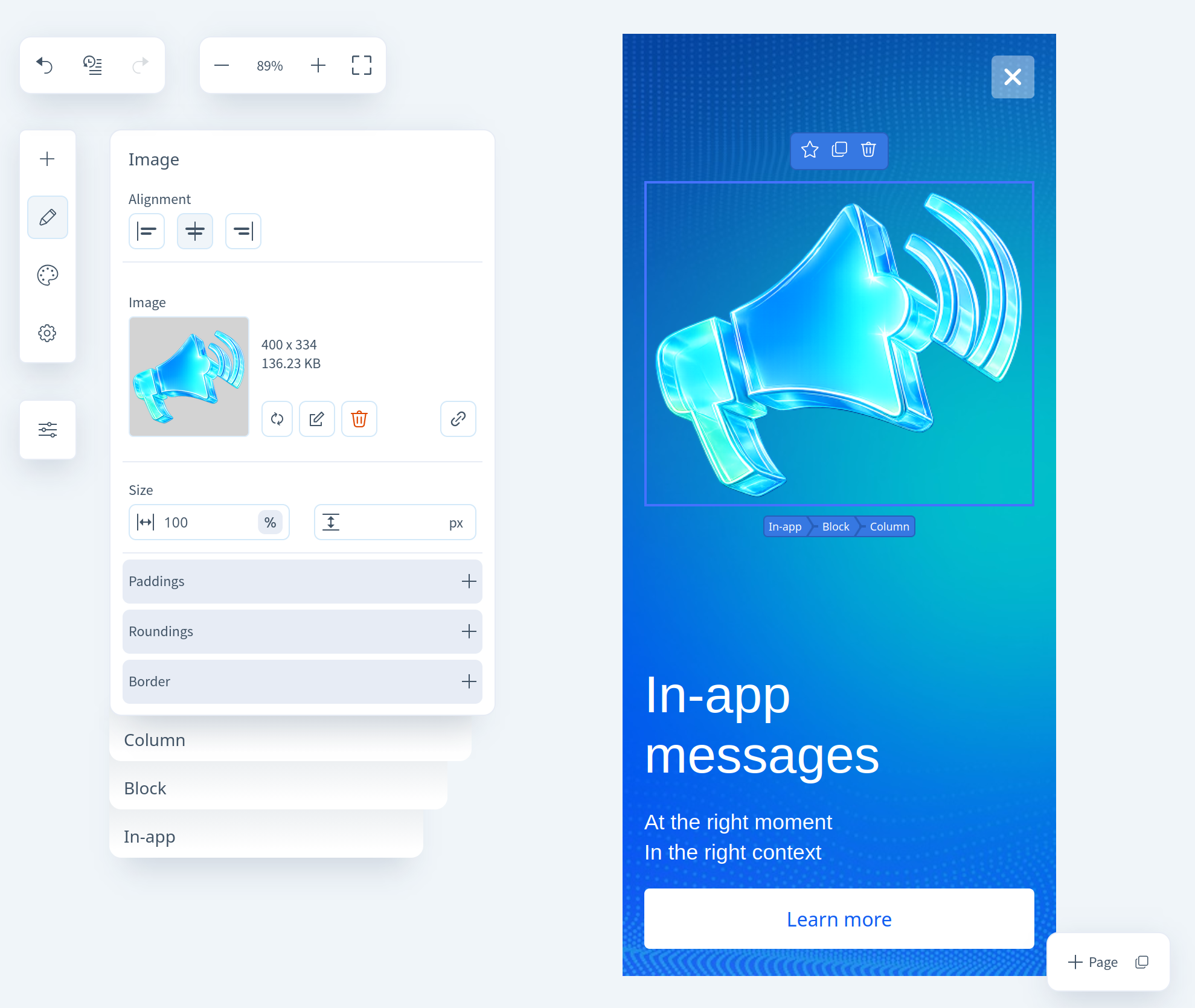
Configurable properties for an image block:
- Alignment of the image within the container;
- Image size;
- Padding within the block;
- Container rounding and its borders;
Button
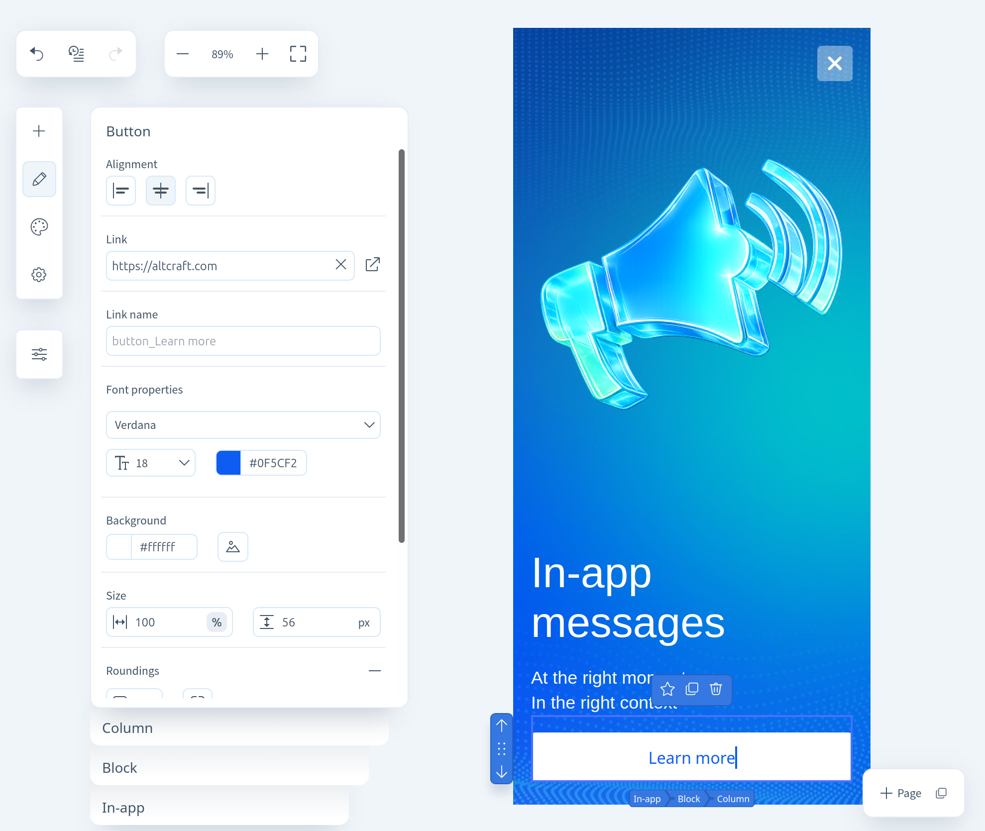
Configurable properties for buttons:
- Alignment of the button within the container;
- Link to follow when clicked;
- Font, size, and color of the text;
- Background of the button (you can upload an image);
- Size, style, and corner rounding of borders, as well as padding within the container;
Separator
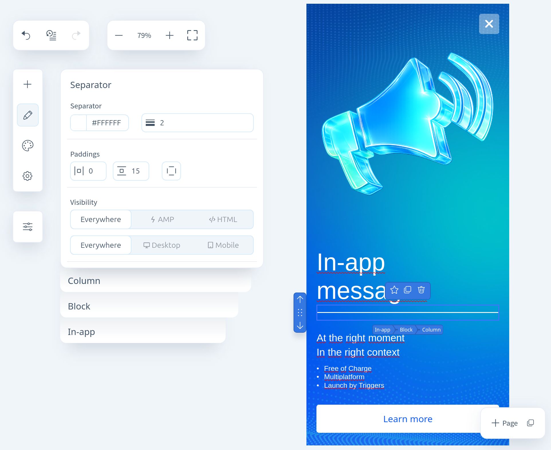
A separator is an empty block with a horizontal line inside. Configurable options:
- Color and thickness of the separator;
- Padding inside the container;
Social networks
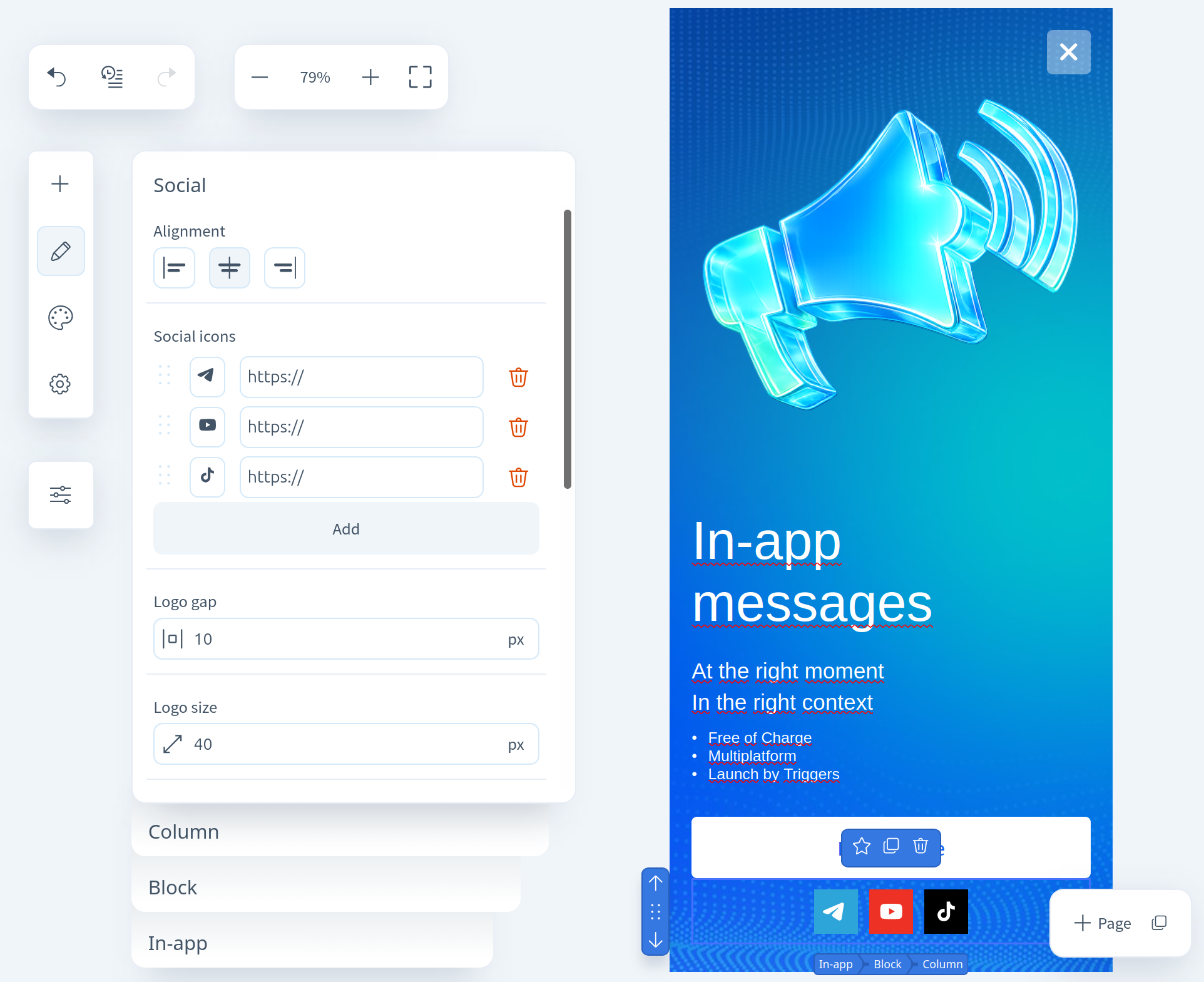
Social Networks — a block with clickable icons of popular social networks. Configurable options:
- Alignment within the container;
- Social network settings — add or remove icons, change their order, and configure click links. You can also set individual background and logo colors for each network;
- Spacing between logos, logo size;
- Logo color and background color — customizable per network;
- Padding inside the container, corner rounding, and borders of logos;
List
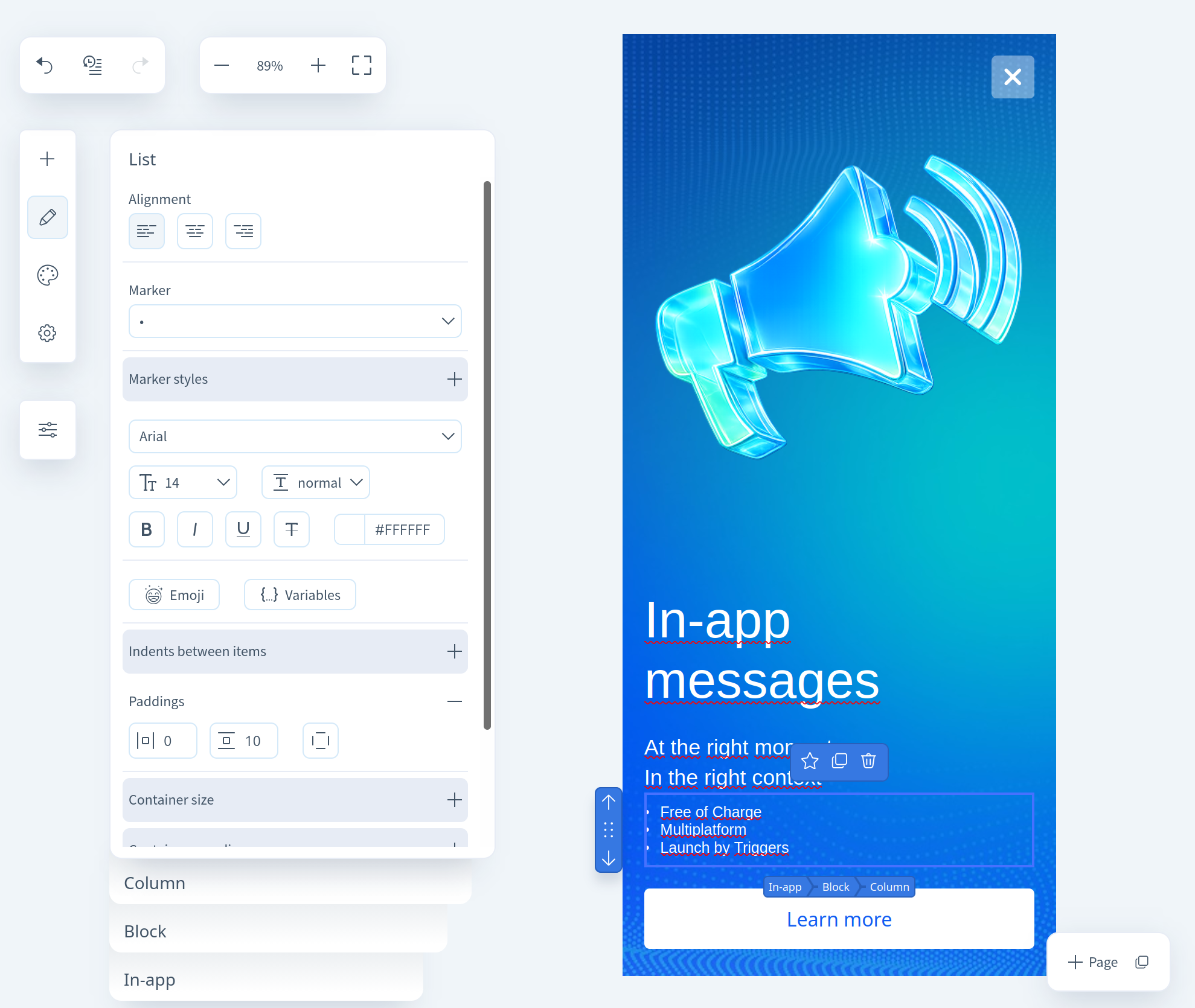
Configurable properties for lists:
- Alignment within the container;
- Marker style, as well as size, color, and font (if a numeric marker is selected);
- Container size and background, border style and rounding, plus padding inside the container;
- Text properties — size, color, font, style, and insertion of variables and emojis. Links can also be inserted into the text;
Ready-made blocks
A collection of pre-designed blocks for various purposes. Using them, you can assemble a basic template in just a minute.
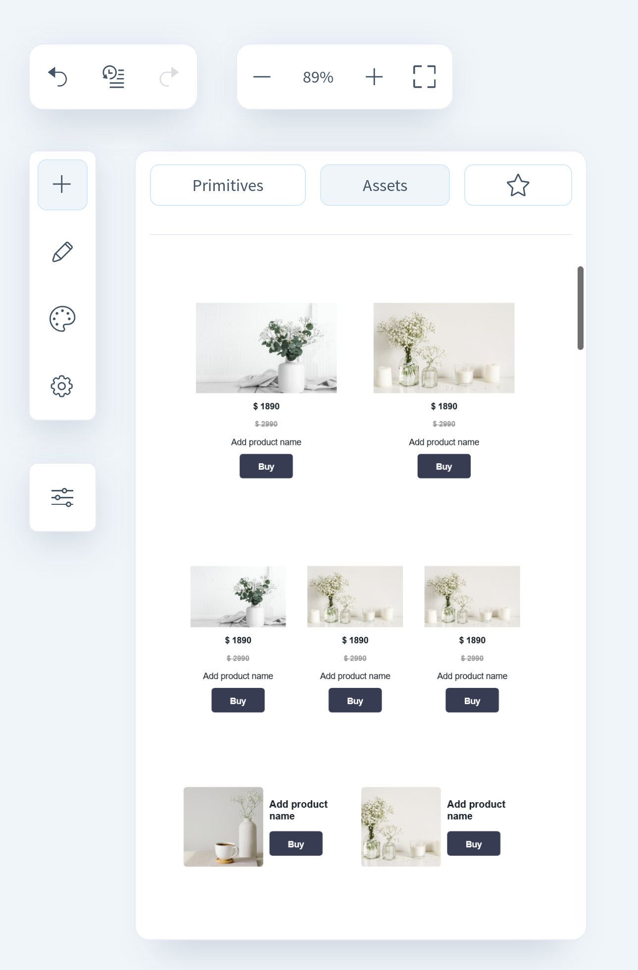
Saved blocks
If you frequently use a specific component or want to apply consistent styled blocks across different templates, you can save it for later use.
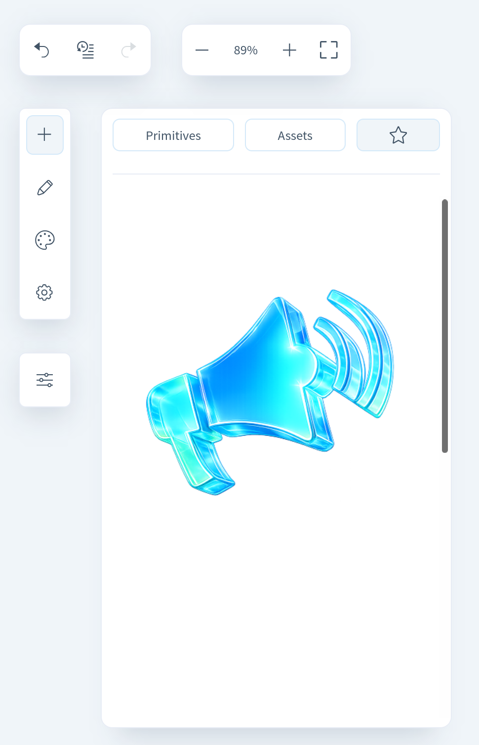
To save a block, click the "star" icon.
After saving, it will always be available in the editor on the respective tab (to the right of the "Ready-Made Blocks" section).
Styles
In the Styles section, you can configure the In-App background and the close button style.
Settings
In the Settings section, you can change the In-App type — the display format selected when creating the template (Fullscreen, Modal, Slideup, Floating bar).
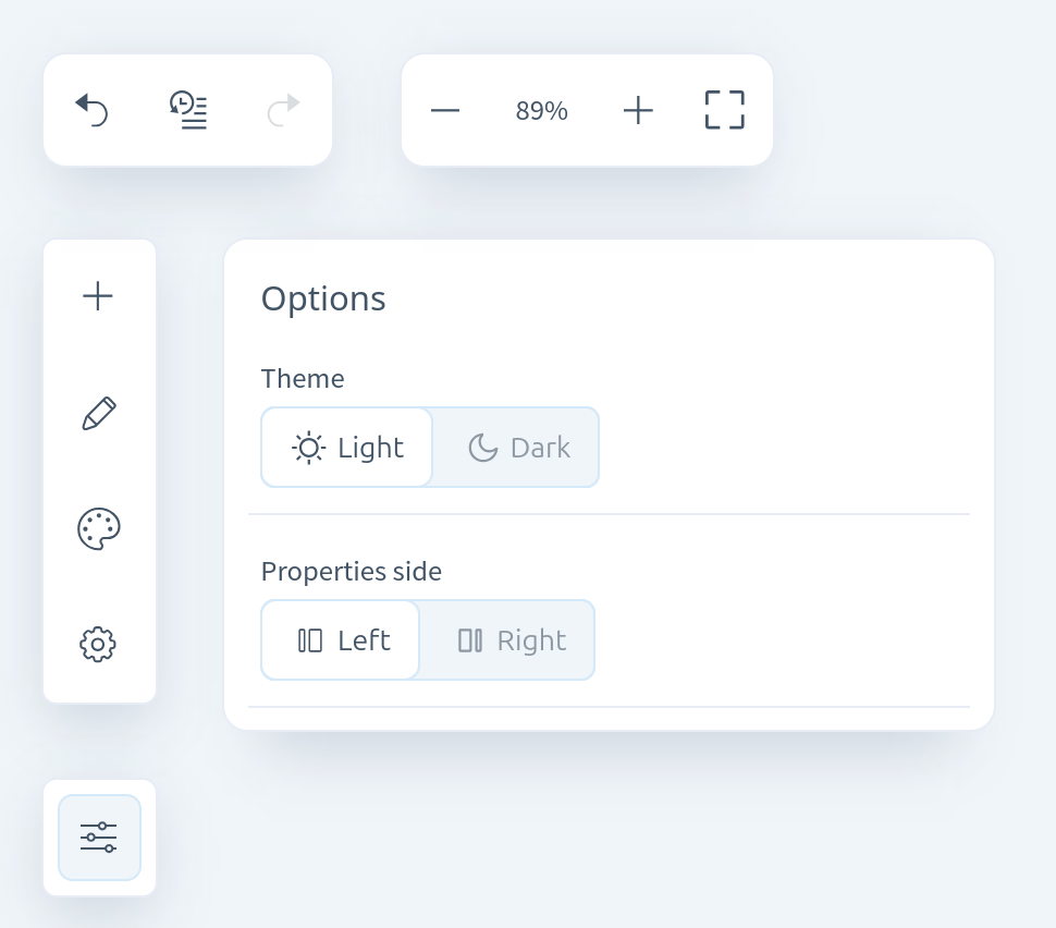
Parameters
In this section, you can adjust the editor's appearance and layout according to your preferences.
- Interface theme — choose between light and dark modes.
- Property panel position — defines where the properties panel appears. You can place it on the left or on the right, depending on your preference.
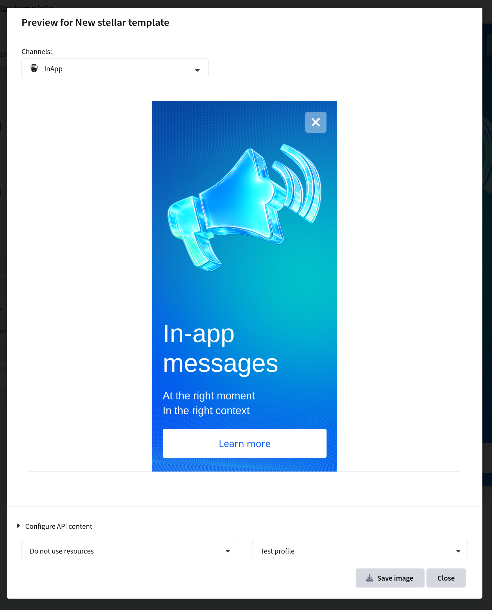
Preview
The editor provides a template preview that shows how the content will be displayed in the app on different devices.
Saving and using
After configuring the template, save it. The saved template can be used in a placement to launch In-App content.
An In-App template is used only in placements. It is not used in broadcasts, regular, trigger mailings and A/B/n tests.