Creating and publishing a pop-up
This guide contains instructions for creating and configuring pop-up windows for your website using the Altcraft platform. You will learn how to style the pop-up, set display rules, and analyze the results.
Full workflow for creating and configuring a pop-up
-
Step 1: Creating a pop-up
Choose the type of pop-up (modal, floating bar, slide-in, page takeover) and a base template for a quick start. -
Step 2: Configuring content and design
Work in the visual editor: add text, media, forms, and adjust the appearance to match your brand. -
Step 3: Configuring actions after form submission
Define what the user will see after submitting data (message, redirect), and configure notifications. -
Step 4: Publishing and configuring display
Integrate the code into the site and set rules for display (time, triggers, target audience). -
Step 5: Analytics and results
Monitor key metrics (conversion, impressions, clicks) to evaluate effectiveness and make decisions.
Each of these steps is described in detail below.
Creating a pop-up
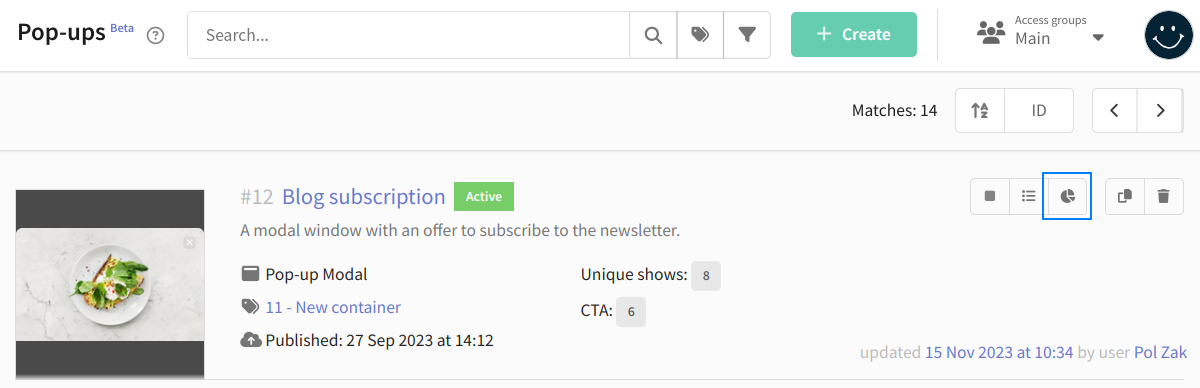
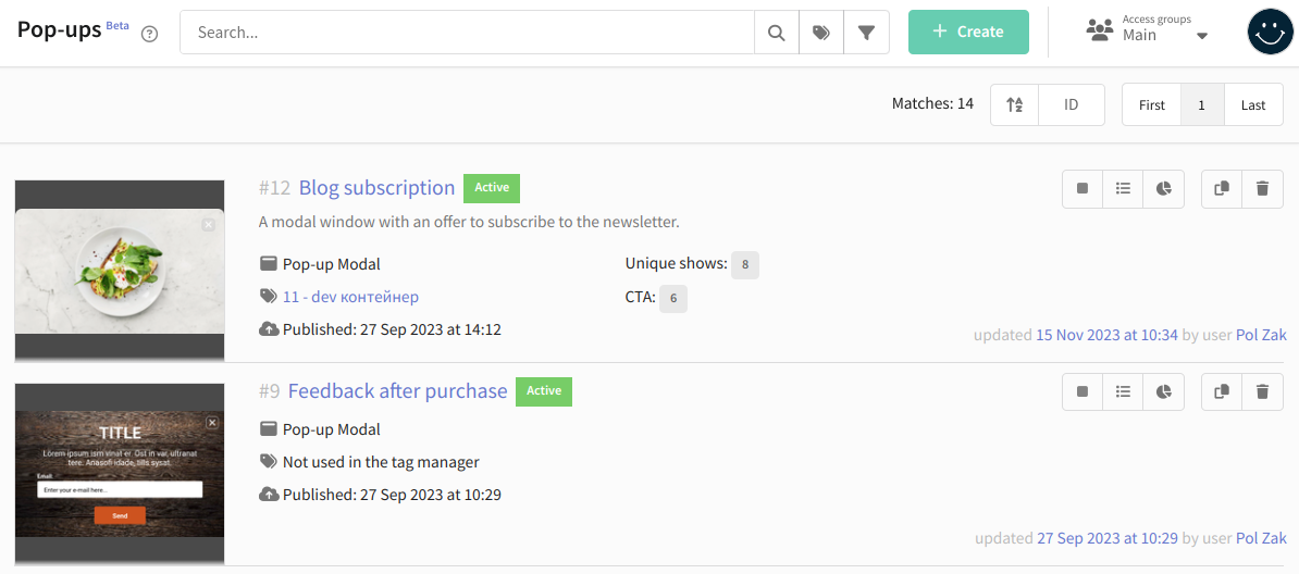
Go to "Weblayers" then "Pop-ups" and click + Create at the top of the page:
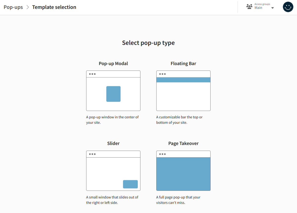
Select the type of pop-up:
-
Pop-up Modal — a pop-up window that appears in the center of the screen. It draws the user's attention by dimming the background. Typically used to collect email addresses.
-
Floating Bar — a customizable panel placed at the top or bottom of the page. It remains visible even when scrolling. Suitable for informing customers about news or limited offers.
-
Slider — a small pop-up window that appears in the bottom-right corner of the page. It is less intrusive and does not interfere with viewing the page content. It can be used to display additional information, offers, or feedback forms.
-
Page Takeover — a pop-up window that occupies the entire browser screen. This ensures visitors do not miss the information. However, full-screen pop-ups should be used carefully, as they can be perceived as intrusive advertising.
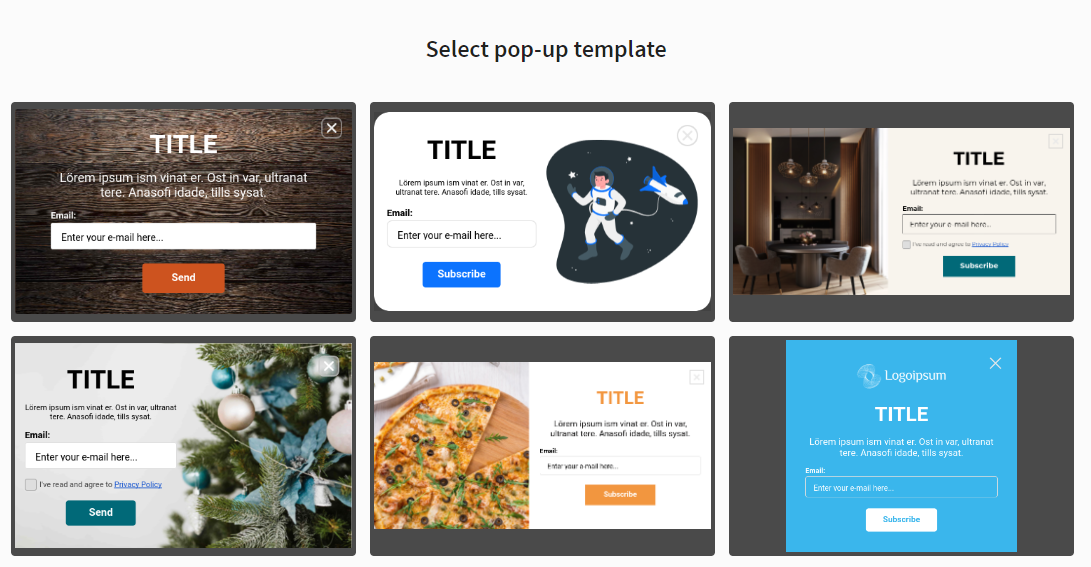
Choose a pop-up template. The platform already includes several ready-made templates. Use any of them as a base. At the next step, you can fully customize the template (text, styles, fields, etc.) for your tasks.
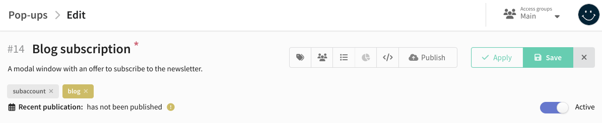
Set the system name of the pop-up and, if necessary, add a description. You can also set tags for quick search  and assign access groups
  .
.
Configuring content and design
The appearance of a pop-up is defined by parameters. Parameters include text, images, and CSS styles. For example, text contains the main body text, and backgroundColor defines the background color.
Two tools are available for editing pop-up content:
- Visual editor. Suitable for users without coding knowledge. Simply enter text, select images from the gallery, or use color palettes.
- Code editor (HTML, CSS, JS). Suitable for advanced users who want to edit the pop-up code directly.
All changes are displayed in the preview window in real time. Use the buttons in the upper left corner to test on different devices.
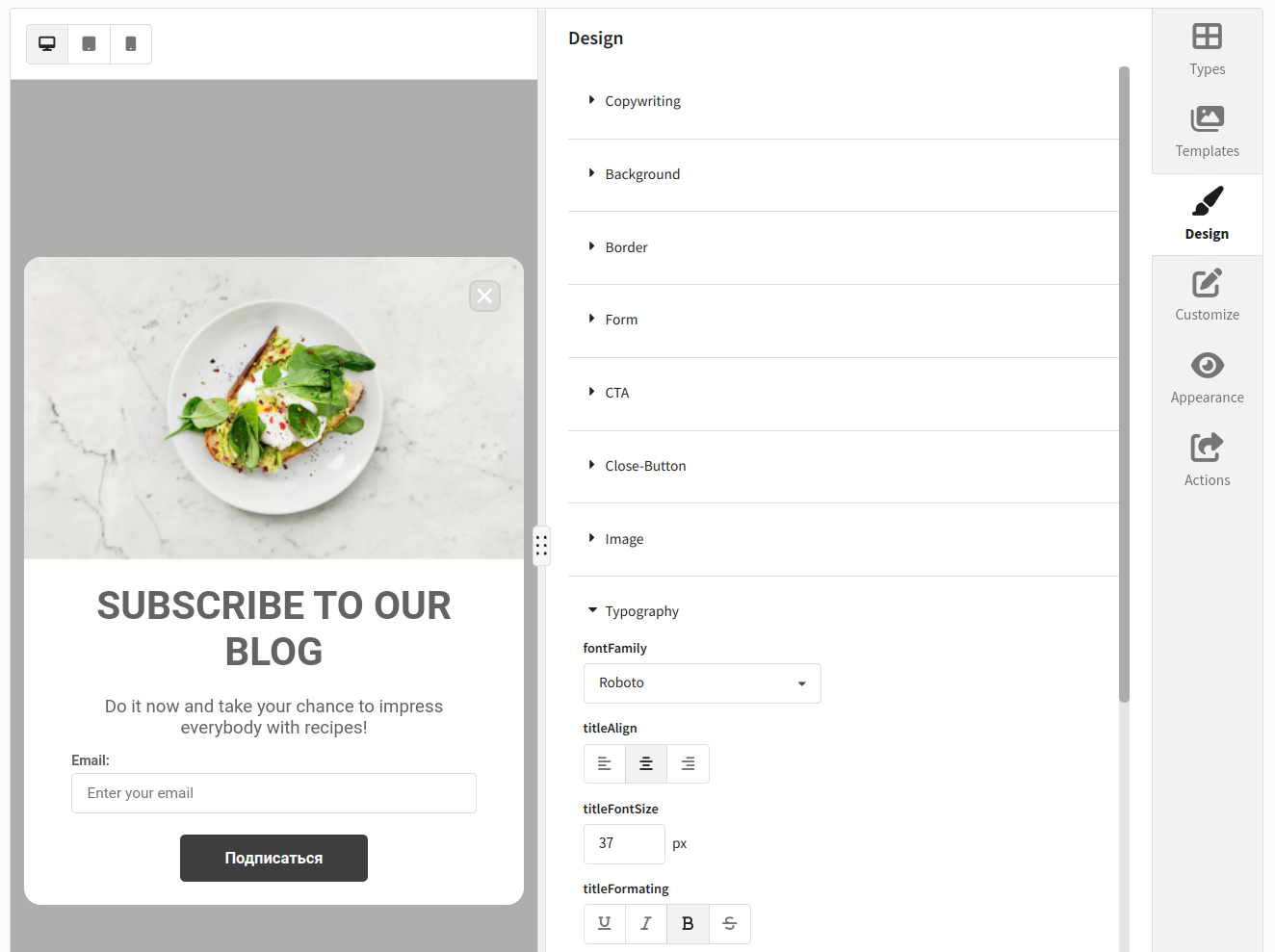
Visual editor
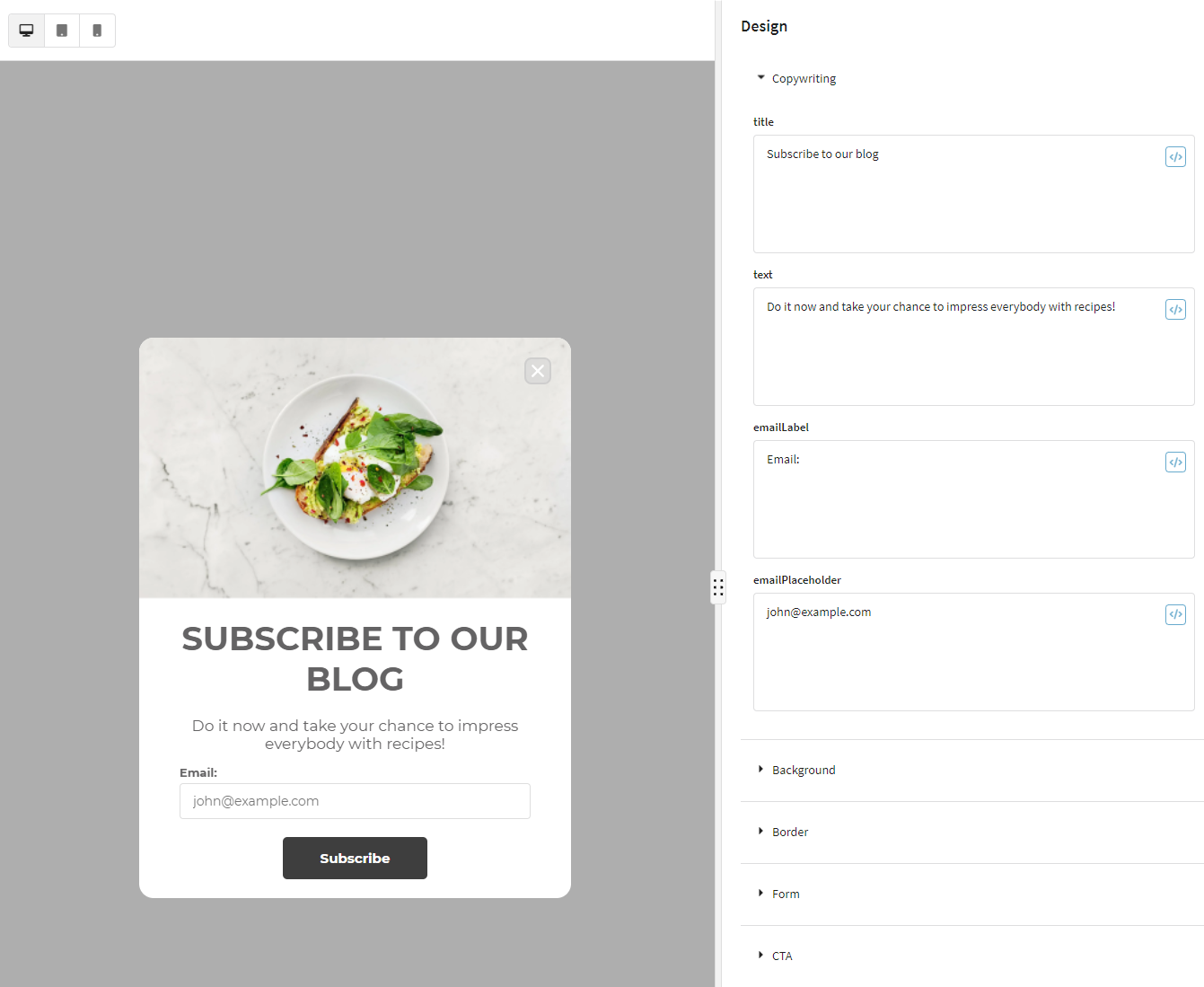
To customize text and design in the visual editor, go to Design. Parameters are grouped into categories:
- Copywriting
- Background
- Border
- Form
- Actions
- Close Button
- Image
- Typography
On the Copywriting tab, set the pop-up text. Available parameters:
- title — heading;
- text — main text;
- <field>Label — label for form fields;
- <field>Placeholder — placeholder inside form fields.
You can insert a </> variable into any text element to dynamically pull profile data. See this article.
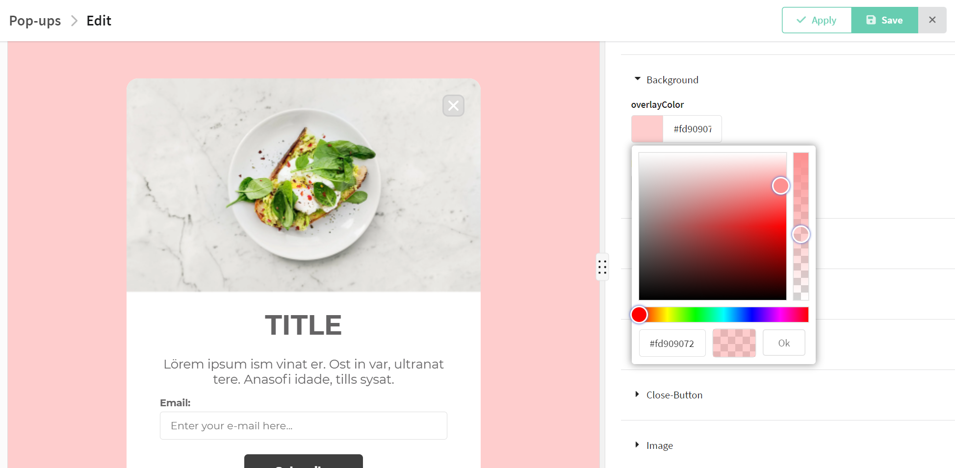
- backgroundColor — pop-up background color;
- backgroundImage URL — background image (upload to gallery
 or specify URL);
 - overlay — background overlay for the page (color and opacity).
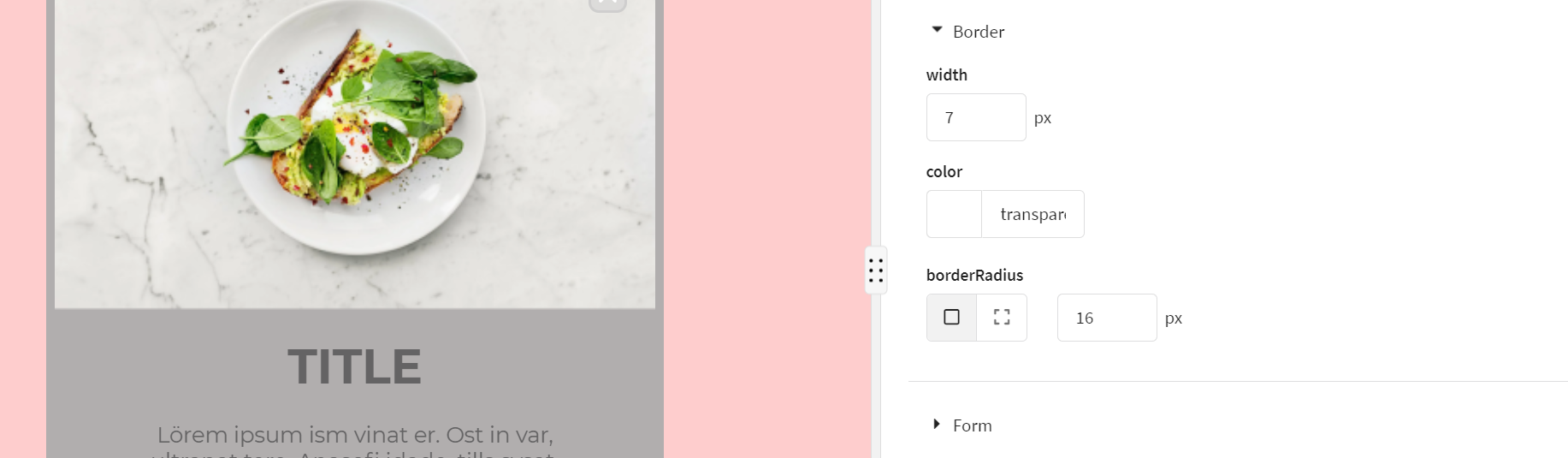
Configure pop-up borders:
- borderRadius — rounding (px, per corner)
 ;
; - width — border thickness;
- color — border color.
Configure form fields:
- set up validation rules;
- specify error messages shown to the user if input is invalid;
- edit CSS styles of form fields.
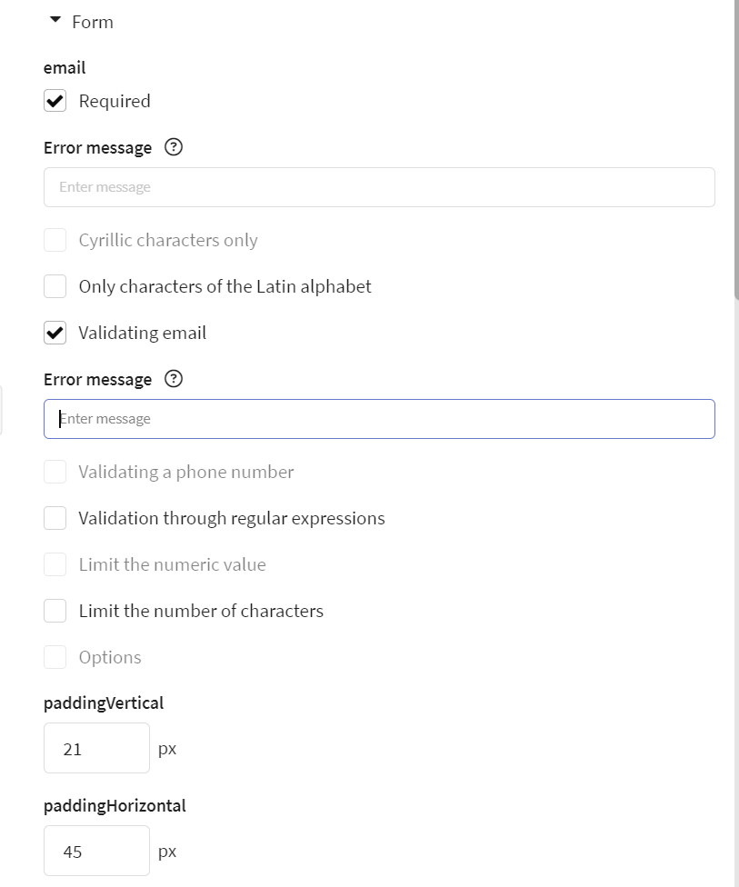
Validation options:
- Required — the user must fill in the field before submitting the form. If left empty, an error message will appear;
- Cyrillic only — only Cyrillic characters are allowed;
- Latin only — only Latin characters are allowed;
- Email — the value must match the email address format;
- Phone — the value must match the phone number format;
- Regex — you can apply your own custom regex validation rules;
- Numeric limits — define minimum and maximum values for numeric fields;
- Character limits — set the maximum number of characters allowed;
- Predefined answers — for fields with a limited set of options. The user must choose one of the allowed answers. If not, an error message will appear;
- Error message — the text shown to the user when input doesn’t meet validation rules. Each field can have its own error message.
Window styles:
- paddingVertical — spacing between the button and the bottom border of the popup;
- paddingHorizontal — spacing between the fields and the left border of the popup;
- width — width of the popup;
- fieldsGap — spacing between form fields, including space between the last field and the button;
- borderWidth — border width of input fields;
- borderColor — border color of input fields;
- borderRadius — border radius of input fields. Radius can be set individually for each corner .
Input field styles:
- inputPaddingVertical — vertical padding of the placeholder text inside the input field;
- inputPaddingHorizontal — horizontal padding of the placeholder text;
- inputFontSize — font size of the placeholder text;
- inputBackgroundColor — background color of the input field;
- inputColor — color of the user’s text input;
- inputHoverColor — border color of the input field on hover;
- inputActiveColor — border color of the input field on click.
Checkbox styles:
- checkboxSize — size of the checkbox;
- checkboxLabelFormatting — formatting of the checkbox label text.
Error styles:
- errorColor — color of the error message;
- errorFontSize — font size of the error message;
- inputErrorBorderColor — border color of the input field when showing an error;
- inputErrorBackgroundColor — background color of the input field when showing an error.
Note: only one form can be created in the visual editor. To add more, use the code editor.
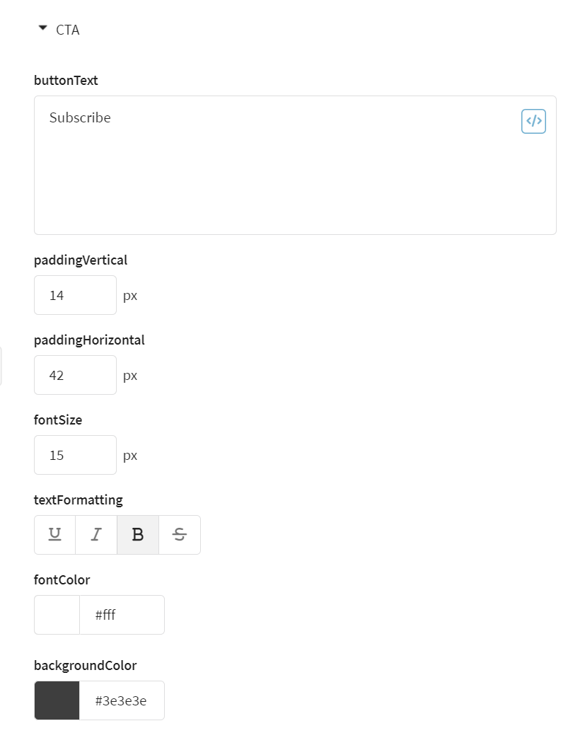
Edit the submit button:
- text — button text;
- textFormatting — formatting of the button text;
- borderRadius — rounding of the button corners. Radius can be set individually for each corner ;
- backgroundColor — background color of the button;
- hoverBackgroundColor — background color on hover;
- color — text color;
- fontSize — text size;
- paddingVertical — vertical padding inside the button;
- paddingHorizontal — horizontal padding inside the button.
Set the appearance of the close button (closeButton).

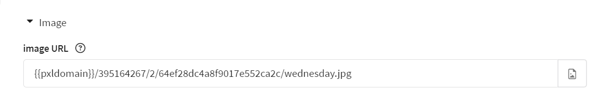
Add an image (not all templates support it):
- image URL — image URL or upload from the platform gallery ;
- width — width in px, height scales proportionally.
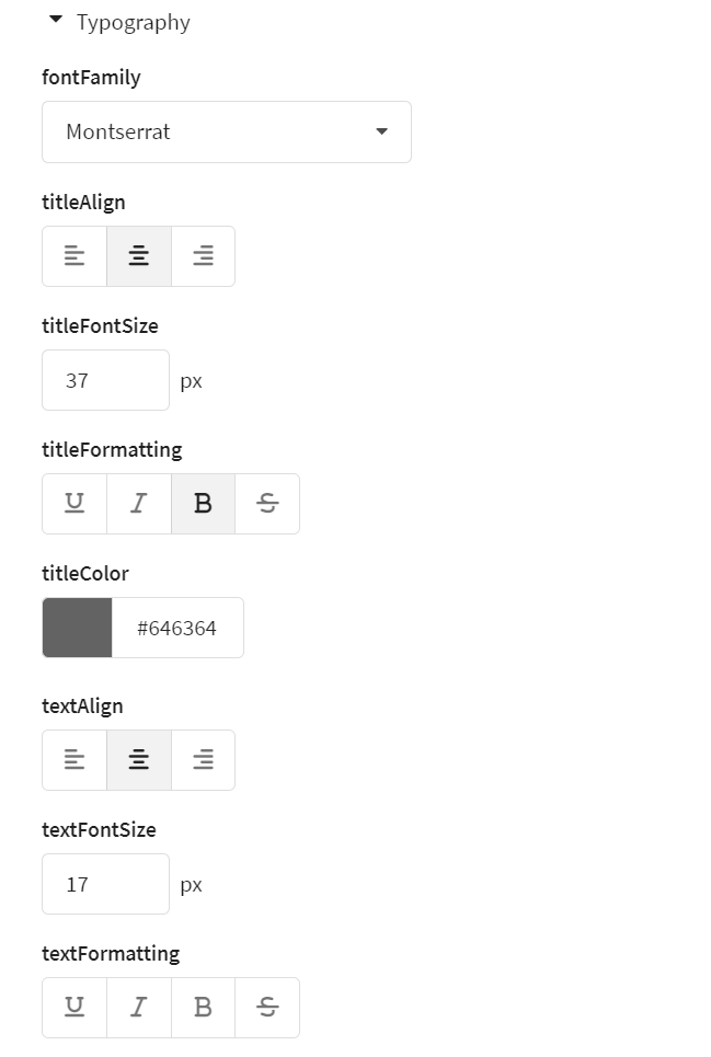
Change text styles for all text elements:
| Category | Parameter | Description |
|---|---|---|
| Global font | fontFamily | Font family used for all text elements in the popup. |
| Title | titleAlign | Alignment of the title (left, center, right) |
| titleFontSize | Font size of the title | |
| titleFormatting | Text formatting of the title (underline, italic, bold, strikethrough) | |
| titleColor | Color of the title text | |
| Main text | textFontSize | Font size of the main text |
| textAlign | Alignment of the main text (left, center, right) | |
| textFormatting | Text formatting of the main text (underline, italic, bold, strikethrough) | |
| textColor | Color of the main text | |
| Label | labelFontSize | Font size of the label text |
| labelFormatting | Text formatting of the label (underline, italic, bold, strikethrough) | |
| labelColor | Color of the label text |
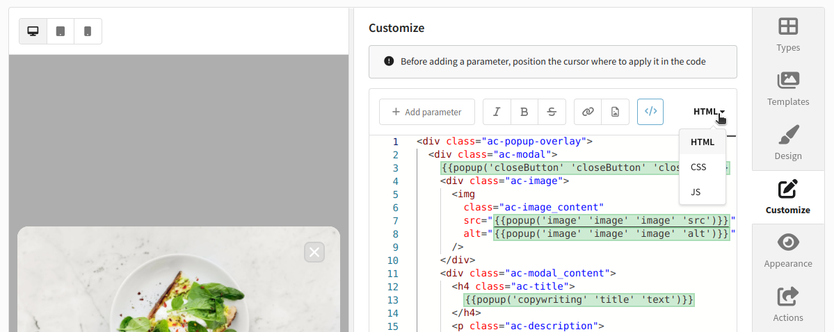
Code editor
Go to Settings to edit HTML/CSS/JS directly. See this article.
Configuring actions after form submission
Go to Actions. Define actions after the user submits the pop-up form:
- Import profiles — save data into one or more databases.
- Send to email — send submission notifications.
Post-submit actions for pop-ups are the same as for standard web forms. See this article.
Configuring publication and display
Two display mechanisms:
- Manual script insertion — direct control, implement display logic yourself.
- Tag Manager — easier: place container code once, configure rules in UI.
Manual script insertion
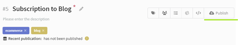
Save settings, set status Active, click Publish:
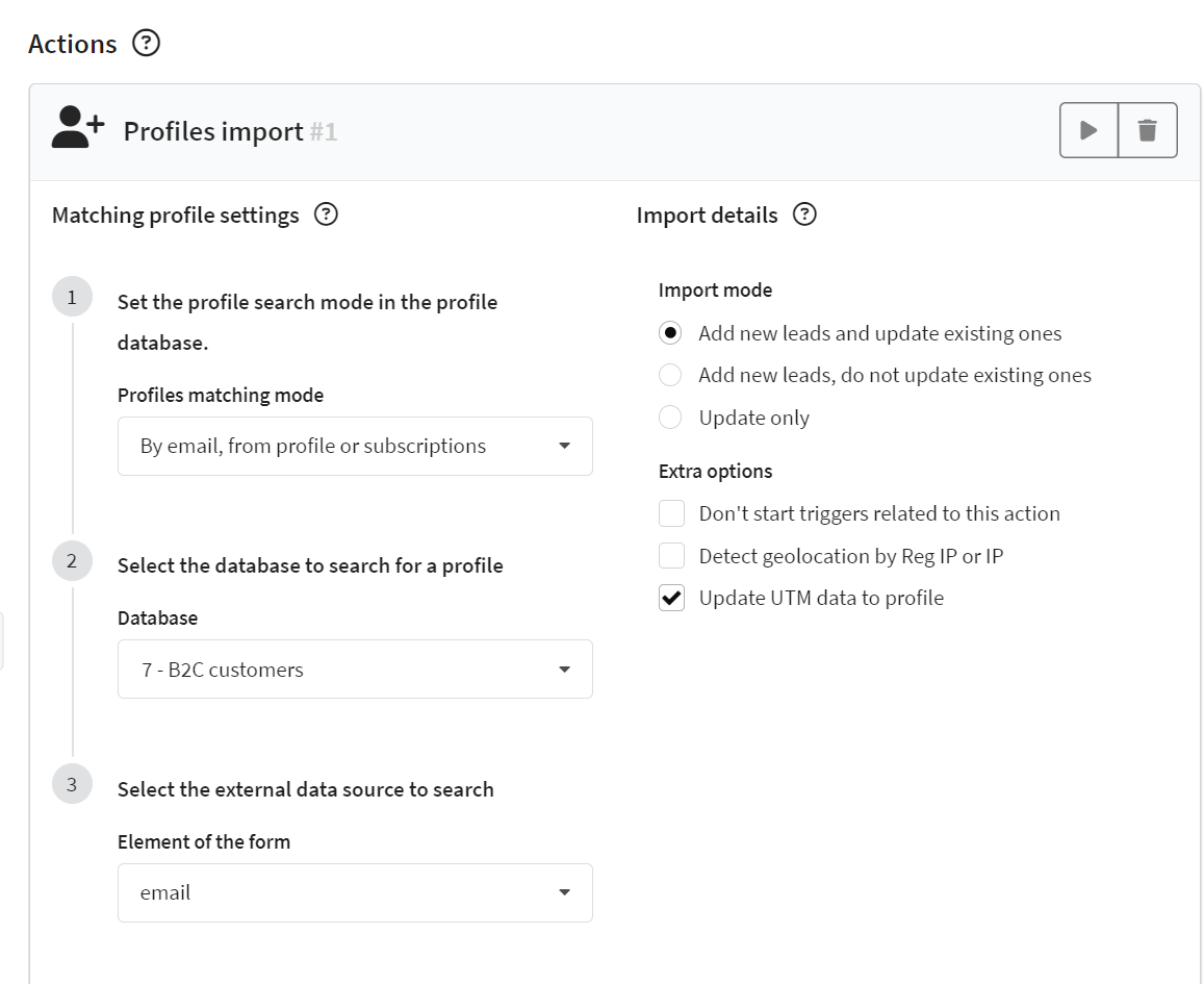
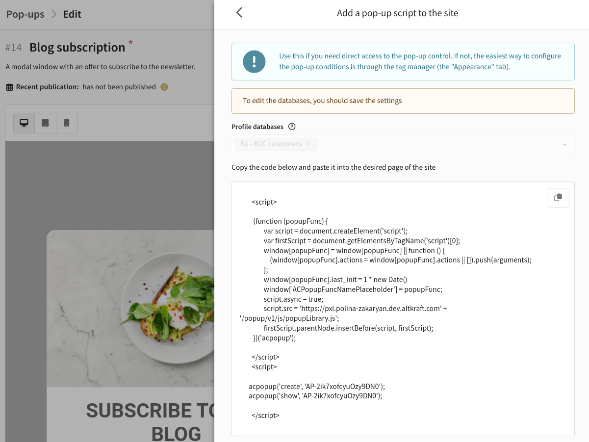
In additional actions, click  . Select databases for profile search. Matching data can be passed with a server data request. If found, data is updated; otherwise, a new profile is created.
Databases here are only for searching existing profiles. Data from form submissions goes to the database specified in Actions.
Click Show code then copy and pass to developers:
Tag Manager integration
Binding to a container
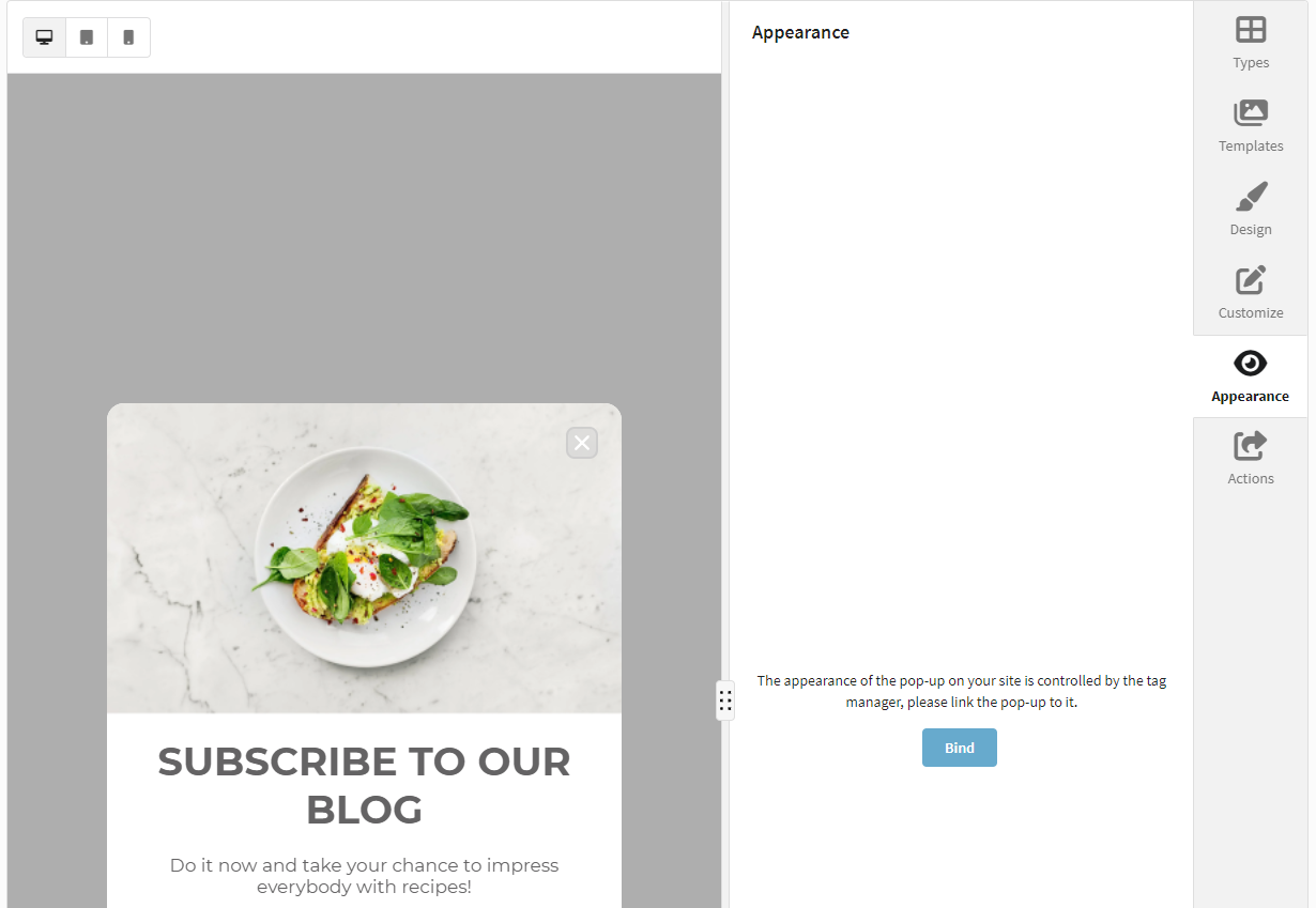
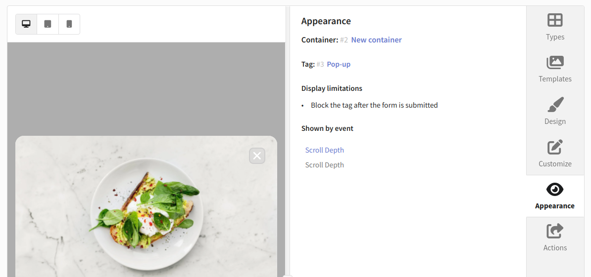
Save the pop-up. Go to Appearance then click Bind:
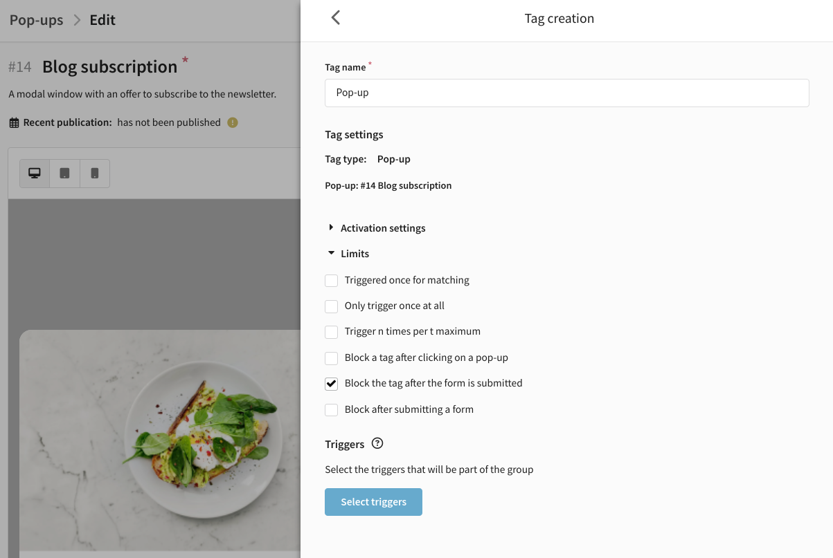
Select or create a container. Enter a tag name.
Tag activation settings
Set activation rules and limits:
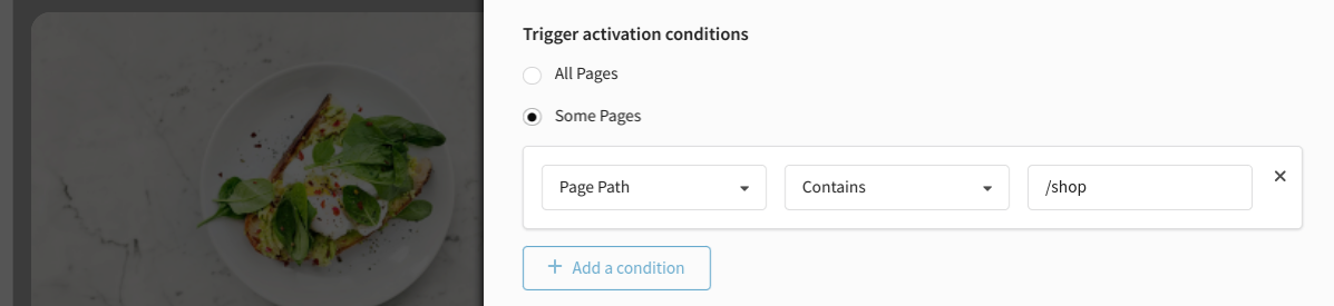
Configuring triggers
Select or create a trigger (page load, click, etc.):
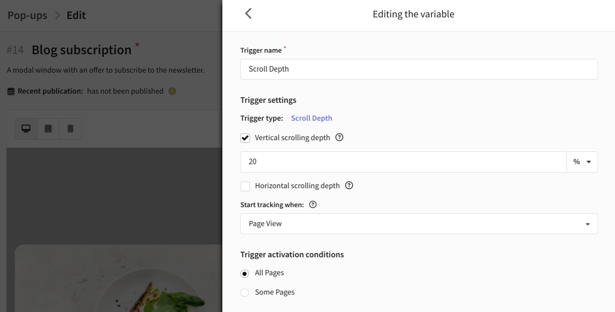
For detailed conditions, set a filter (Some events):
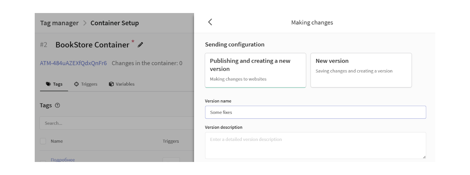
Publishing changes
Save the tag. It will appear in Appearance:
Save and publish the pop-up. Publish the new container version:
Learn more about containers, tags, triggers, and variables in this article.
Profile matching
You can identify a visitor manually with acDataLayer.push(). If a profile exists, its data will be updated.
acDataLayer.push({
  matching: {
    matching_mode: "email",
    matching: { email: "test@example.com", db_ids: [1, 2] },
  },
});
- matching_mode — search mode ("email", "email_profile", "phone", "profile_id", "custom").
- matching — object with parameters for search and database IDs.
Analytics and results
Analyze statistics in Analytics. Click the  icon in the editor or pop-up list: