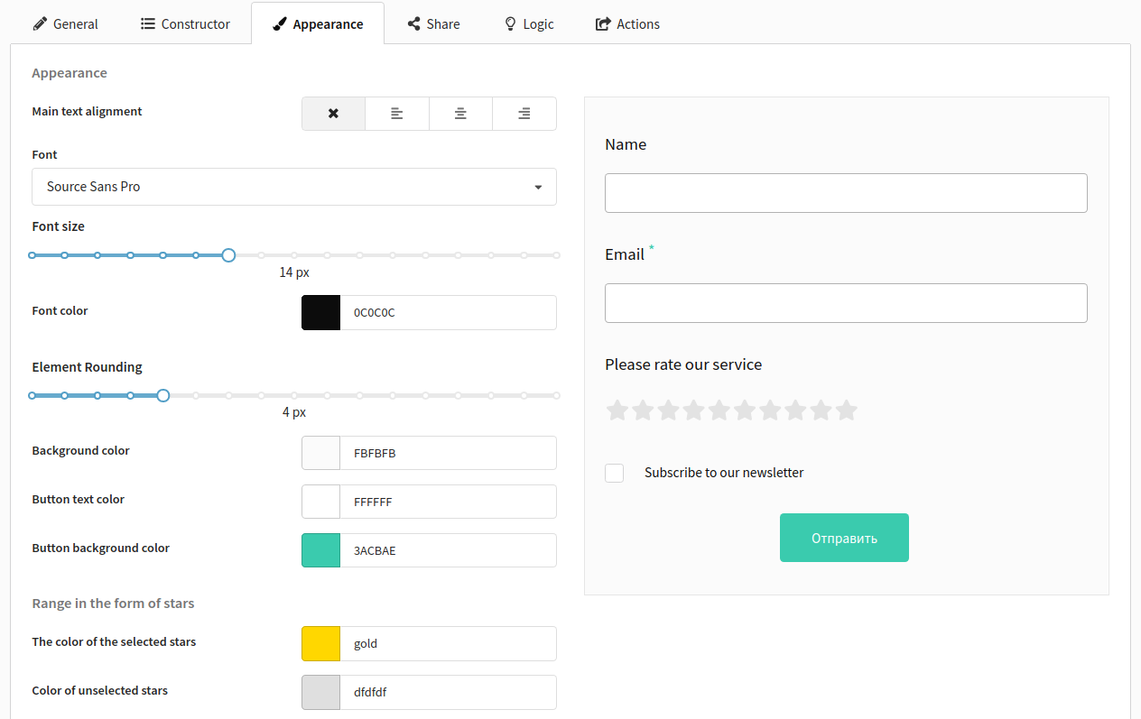
Appearance
On the Appearance tab, you can customize the form's look and feel: fonts, colors, element alignment, and button styling. Here you can adapt the form design to match your website or brand style.
Main appearance settings
Configure the visual appearance of the form:
- Fonts — font family and size
- Color scheme — text, background, and button colors
- Alignment — element layout (left/right alignment, center)
The left side displays a real-time preview of the form.
Button styling
The following buttons are available for styling:
- Submit — to submit the form
- Previous — to go to the previous form page
- Forward — to go to the next form page
- Button to go to the site — on the final page
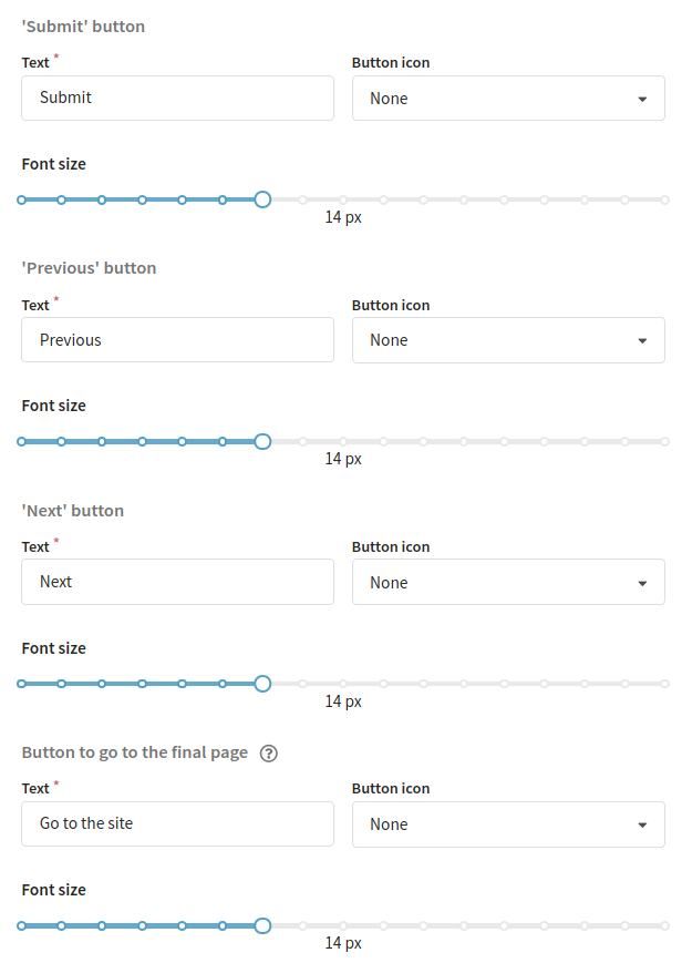
For each button, you can specify:
- the text displayed on the button
- font size (in pixels)
- an icon

Button to go to the final page
If you leave the button text field empty or do not specify a link to go to after filling out the form on the General tab in the final page settings, the button will not be displayed.
Saving the form
After configuring the field structure and appearance, you need to save the form. Only after this will the actions settings upon form activation and the ability to publish it become available.