Elements and their settings
Adaptive layout
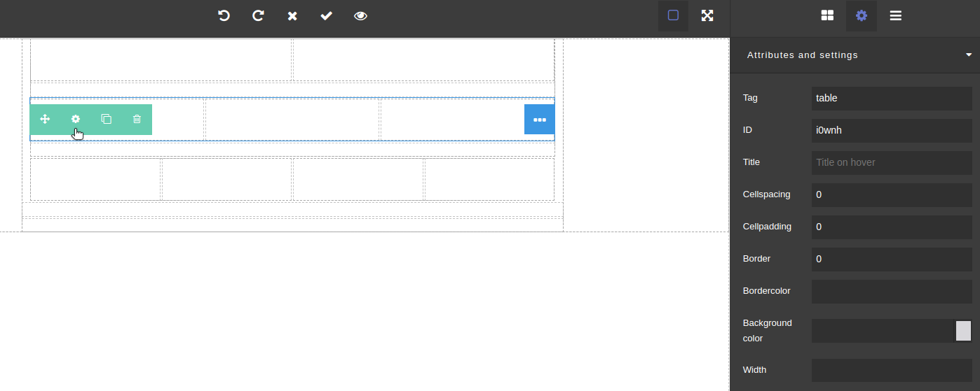
The following attributes and settings are available for adaptive layout strings:
- HTML tag
- Element ID
- Title on hover
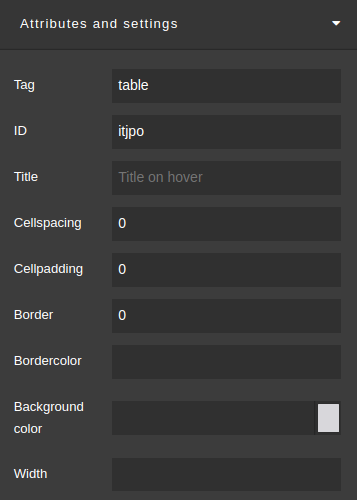
- Cellspacing
- Cellpadding
- Border
- Border color
- Background color
- Width of the section
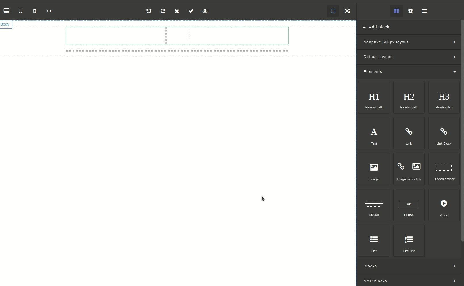
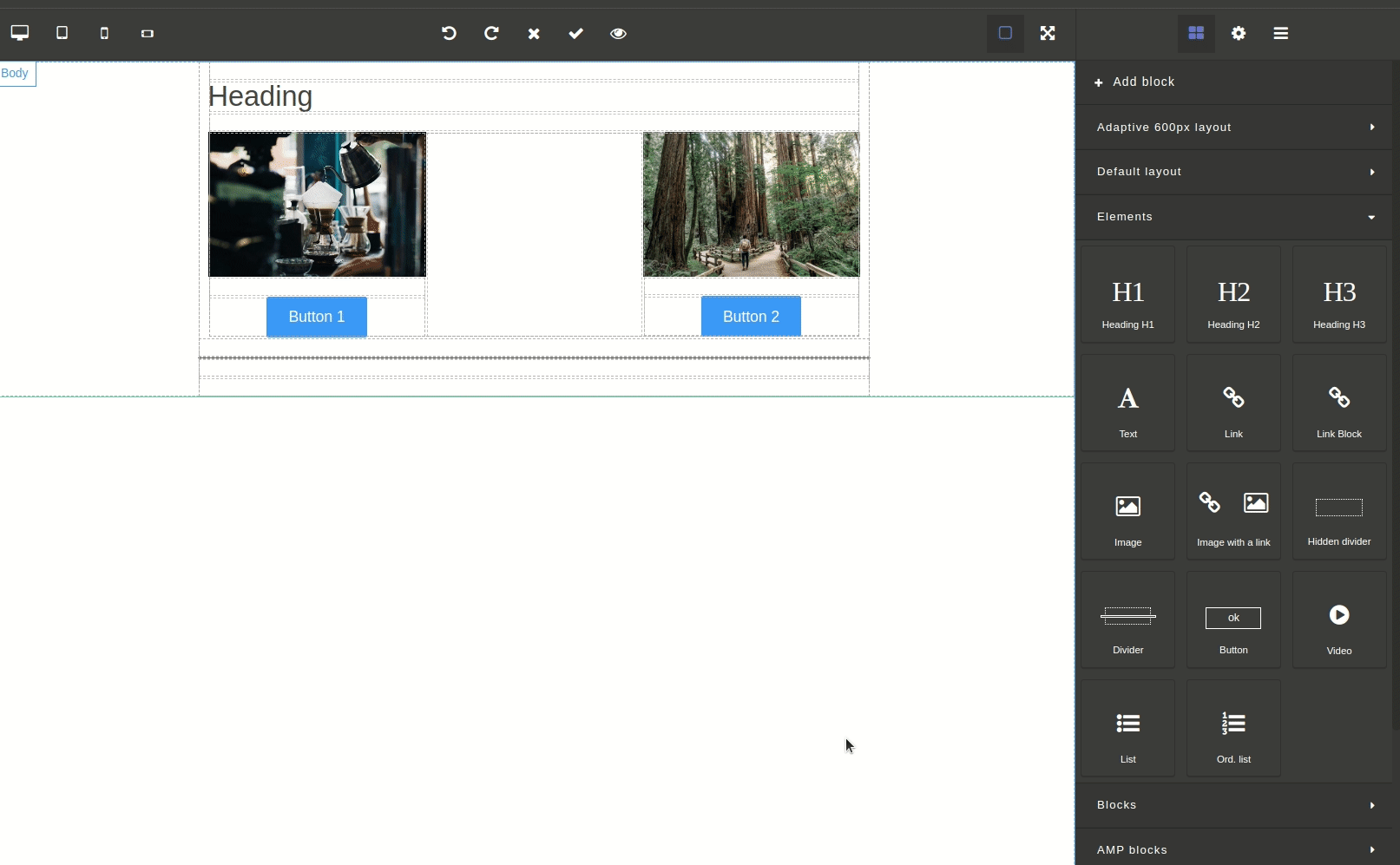
To see the Attributes and Settings tab, select the element of the adaptive layout, hover over the green icon on the left side of the container and click  in the pop-up window.
Adaptive layout cells are displayed as containers, for which you can set only title and identifier.
Default value
When it comes to the default layout, you can also add cells and change width percent ratio.
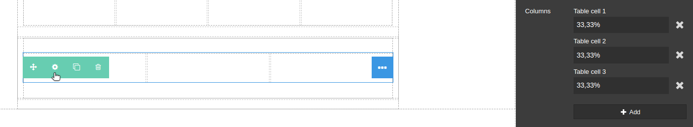
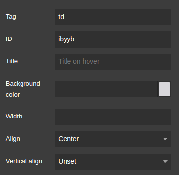
The following options are available fordefault layout cells:
- ID
- Title
- Background color
- Width
- Horizontal and vertical align
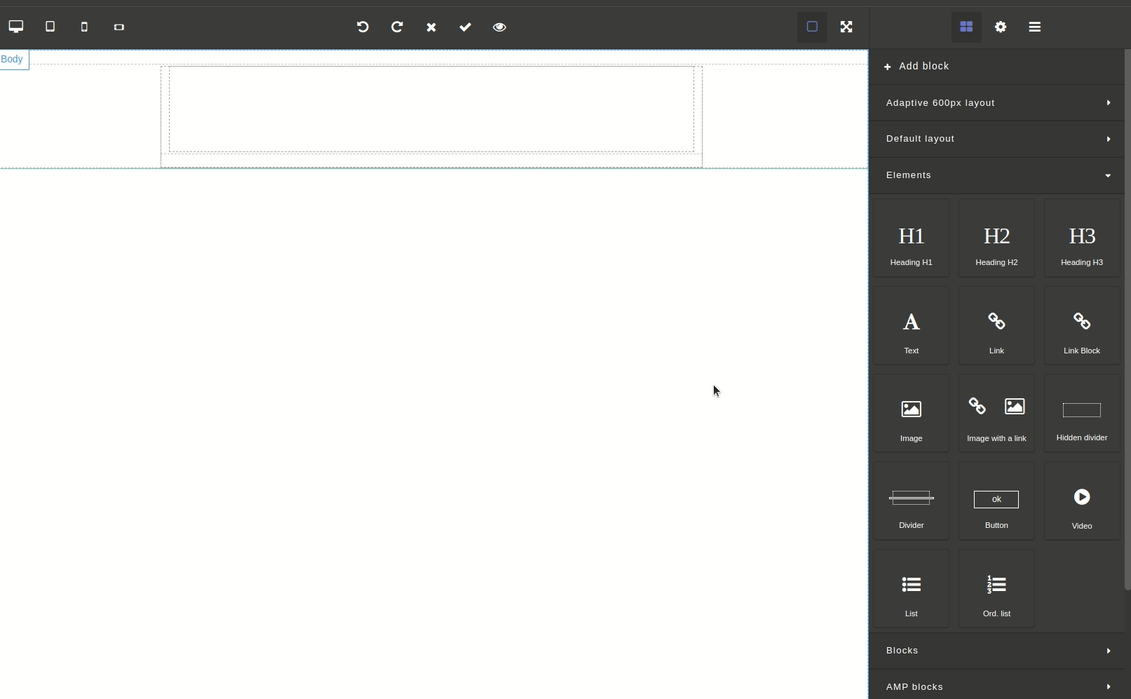
Elements
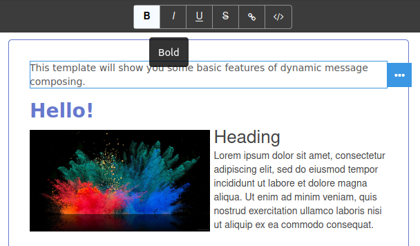
You can use WYSIWYG editor to edit the text in such elements as Heading, Text, Link and Button.
WYSIWYG editor for text elements
The WYSIWYG editor is available for text elements, like Header or Text. Click twice on the text element to edit its content in the central part of the editor.
Double-click on the text element and the toolbar at the top of the editor will switch to text editor mode. You will be able to edit the text of the element in the central part of the editor. By the way, you'll immediately see the result.
Toolbar let you:
- format text (bold, italic, underline,
strikethrough), - add links,
- add variables.
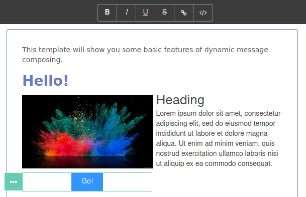
You can edit text on the Button element in the same way:
Text display options, as well as the behavior of links and buttons, are configured on the right side of the editor and are described later in the next article.
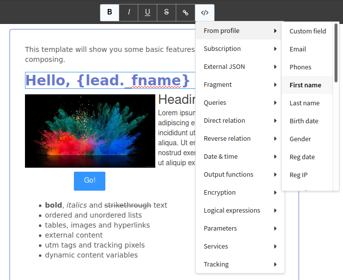
You can use the variables menu to add profile data and logical expressions to the template.
To insert custom fields value into the template, use {lead.custom_field} expression (custom_field - full name of custom field).
Let's take a look at each element:
Heading
Heading attributes and settings:
|  |

Text
Text attributes and settings:
| |
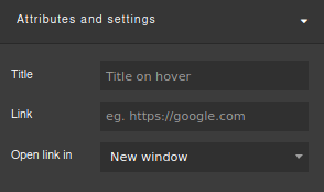
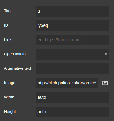
Link and Link block
Link attributes and settings:
| |

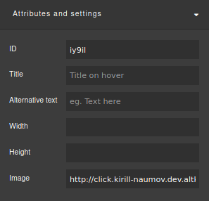
Image and Image with a link
Click twice on the element to open platform image gallery. You can use the search by file name or by tags.
Using form at the top part of the gallery, you can upload your images. Just drag ad drop the file you want, or click on the Browse button and select image.
After you select image, open it and click Insert button. You can also add or remove tags for images.
Image attributes and settings:
|  |
Divider and Hidden divider
Dividers allow you to visually separate items from each other.
For the divider, you can set the size in pixels and choose a color:

For the hidden divider, you can set height (in pixels):

Button
Button attributes and settings:
| |
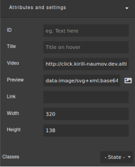
Video
Video attributes and settings:
|  |
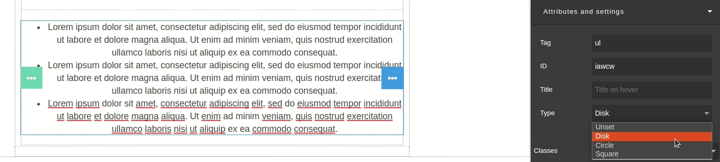
List
For an un ordered list, you can set ID and title, and select marks type (disk, circle or square):
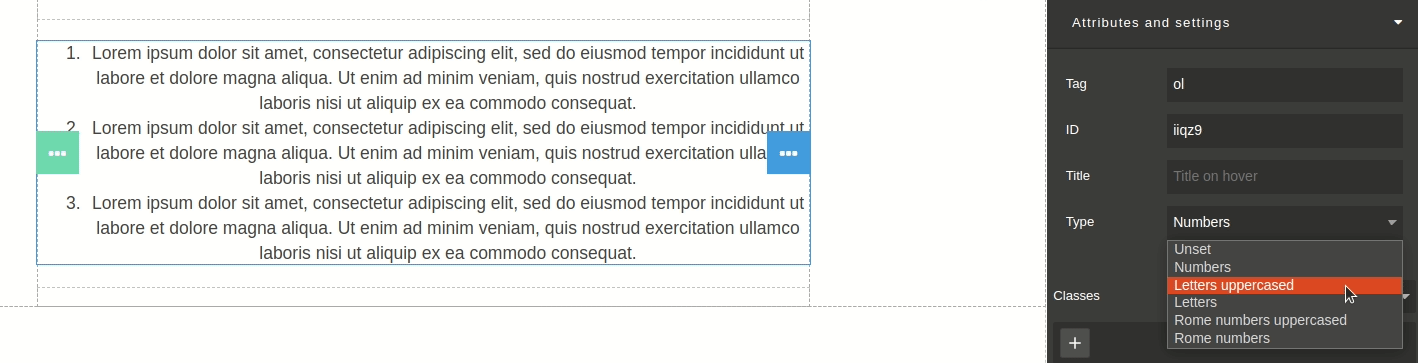
For an ordered list, you can select numeration type (numbers, Roman numbers or letters):
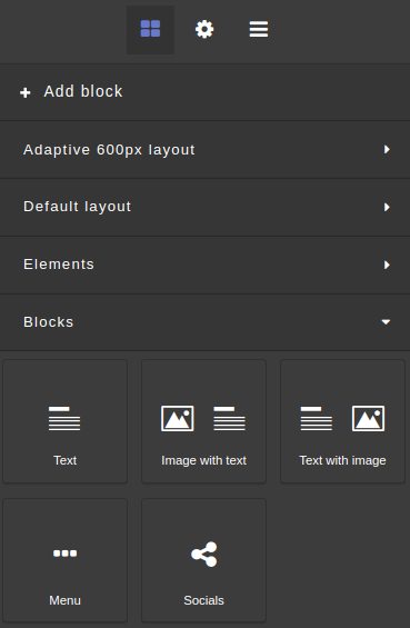
Blocks
Blocks are containers that already contain certain elements.
The blocks make it easier to work with the template, since they are some kind of templates for the platform user, which he, with a high degree of probability, uses in almost every email message. If you are tired of repeating the same monotonous action over and over again, then it's time to use blocks.
Text
The Text block is a container that includes an h1 heading and a paragraph.
| How it looks | Attributes and settings |
|---|---|
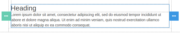 | 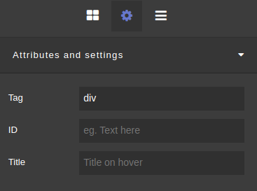 |
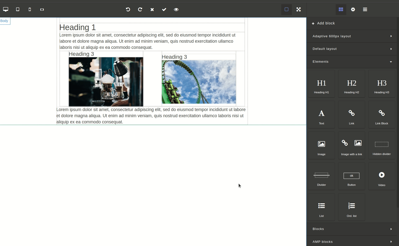
Image with text
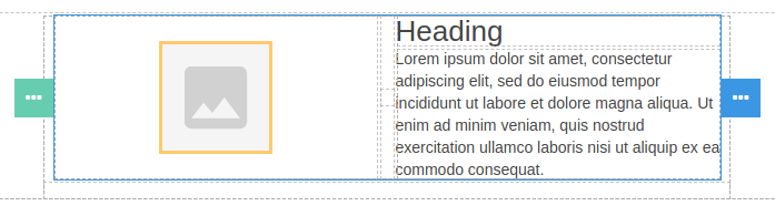
The Image with text block is a table consisting of two cells. The cell on the left contains the image, and the cell on the right contains the h1 heading and paragraph.
| How it looks | Attributes and settings |
|---|---|
 |  |
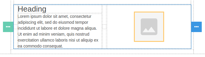
Text with image
The Text with Image block is a table consisting of two cells. The cell on the left contains the h1 heading and paragraph, while the cell on the right contains the image.
| How it looks | Attributes and settings |
|---|---|
 | |
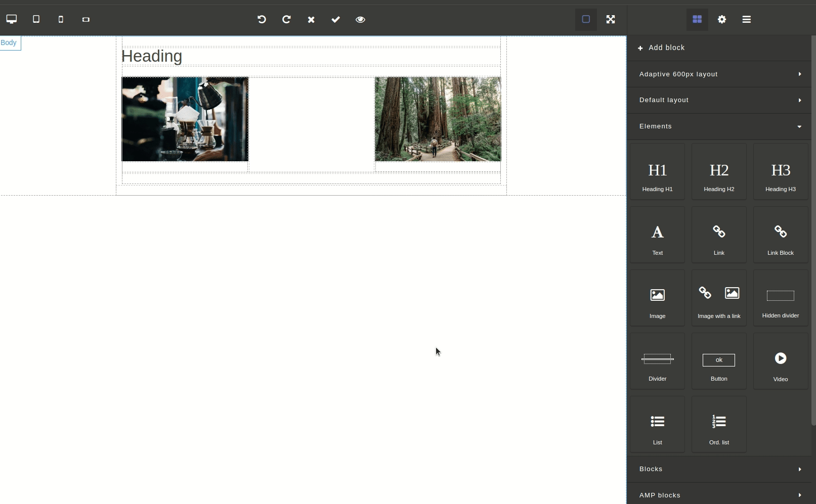
Menu
The Menu block is a table consisting of 4 cells of the same width.

Each cell includes a link that you can customize in the Attributes & Settings panel. There you also have the ability to change the outer and inner margins between cells, adjust the border width and the total width of the element, set the background color and vertical and horizontal align.
Socials
The "Socials" block is a container that includes 8 images with links to social networks.
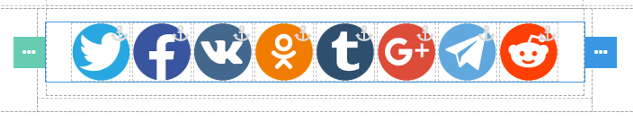
For each item, you can set your own link to click, add alternative text, customize the image, and change the width and height of the element.
AMP blocks
AMP emails is a technology that allows marketers to embed interactive elements such as carousel and accordion into their emails. The user, in turn, can view the data without even opening a new tab to visit the website.
How to use AMP blocks in the Altcraft Platform:
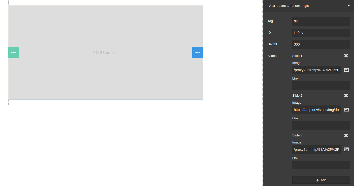
Carousel
AMP carousel is a block that includes several slides. A carousel allows multiple pieces of content to occupy the same area of space on a page or screen.
AMP carousel settings are set in the "Attributes and settings" section. You can set element ID and height and add slides, for which you can set images and links. You can upload your image, select it from the gallery, or insert image URL:
Accordion
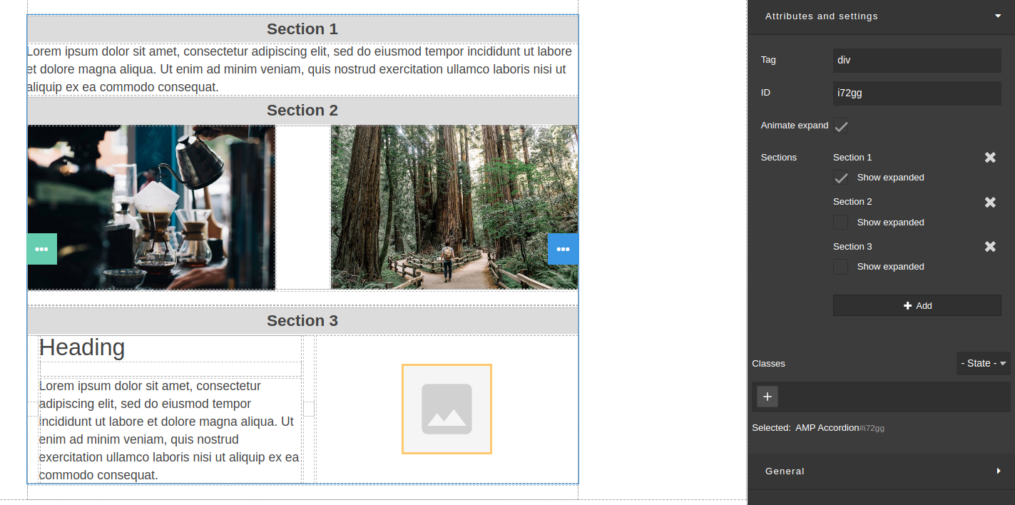
AMP accordion is a block consisting of several tabs with elements. Each element can be "expanded" with a specific action from the user side (click, mouseover). You can add any elements to the sections.
An interface element such as the accordion not only helps users navigate quickly through content, but also allows the UI designer to include large amounts of information in a limited space.
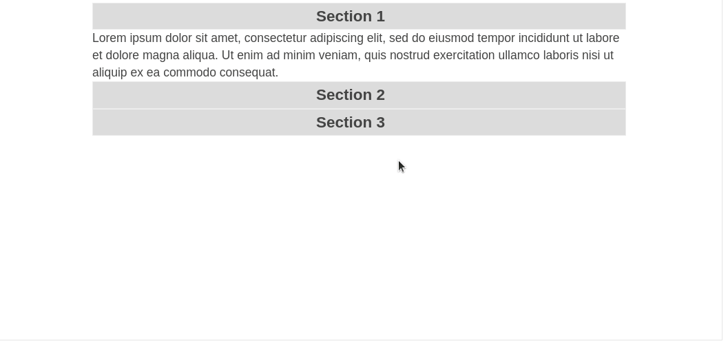
AMP accordion settings are set in the "Attributes and settings" section. Select the block and add the desired amount of tabs. Sections can be opened or closed by default.
If you've already figured out how to add and configure elements in the template, the last thing left is to style the elements