Element styles
The central button on the right side of the editor opens the styles menu for the selected element. The set of settings and attributes may vary depending on the element. Basic styles remain available for all elements and are written to the style attribute of the HTML markup, so you can easily configure a template that will display consistently across all email clients.
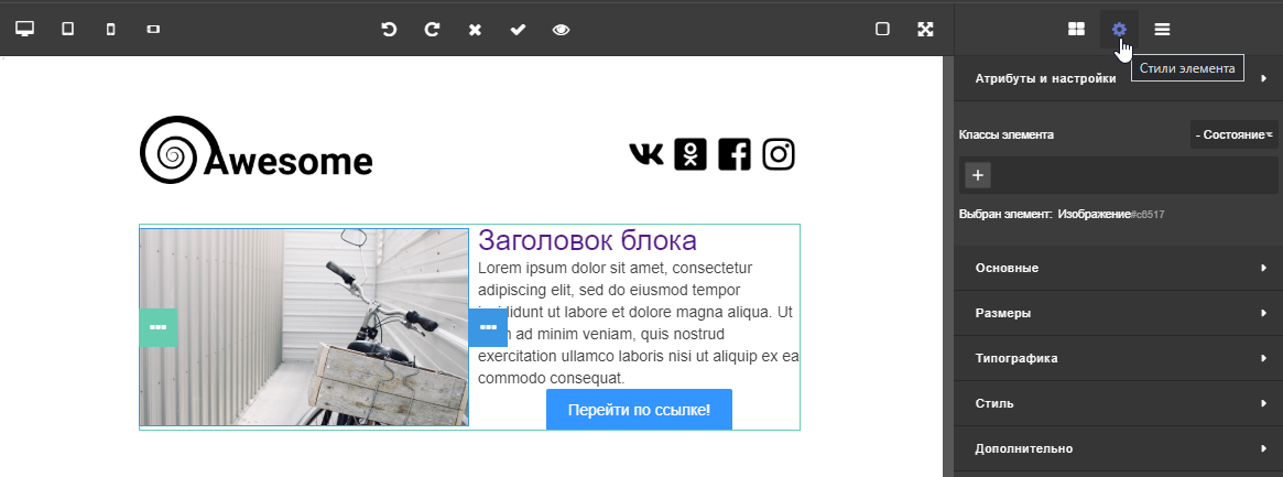
Classes and state
At the top of the menu, you can assign a specific style class to the element and switch its state — to add hover or click effects. | 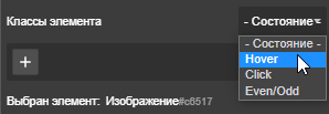 |
Basic
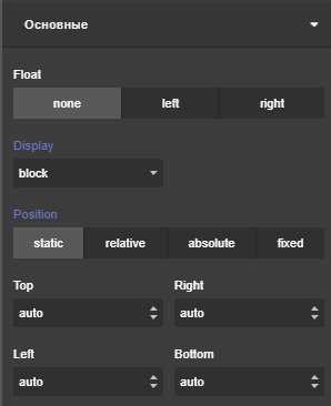
The basic styles section sets the element position in the email:
|  |
Size
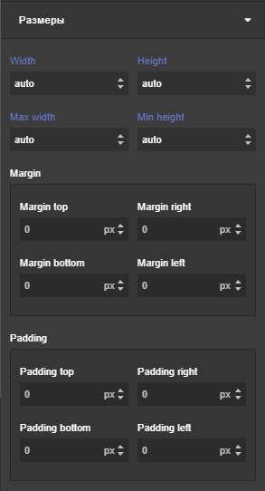
The Size section configures the following display parameters:
|  |
Typography
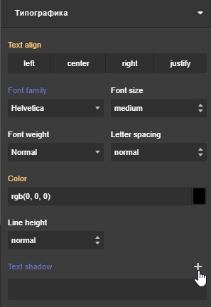
The Typography section contains text display parameters:
|  |
Style
The Style section configures element border, background, and shadow parameters:
Box shadow — adds an inner or outer element shadow. You can configure shadow offset, thickness, and blur, as well as choose a color: 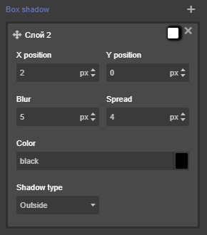 Background image — adds a background image to the element. You can select an image from the gallery or upload from your computer, configure size, repetition, and background position: 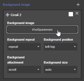 | 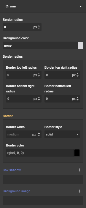 |
Additional
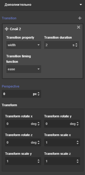
In the additional parameters section, you can configure element animation when transitioning between states. Here you can also configure AMP elements, such as an image carousel.
|  |