Block editor for email template
Block editor for email template is a tool for creating, editing and customizing marketing email templates and emails without writing code. It is designed for marketers and designers who want to quickly assemble professional emails with an easy-to-use interface using blocks, visual elements and design customizations.
Detailed instructions, usage examples and tips on how to use the editor are available in a documentation.
Getting started
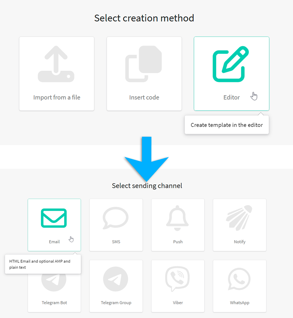
In the main menu, open the Templates section and create a new message template. Select Editor —> Email.
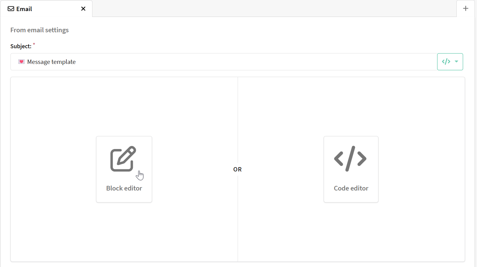
You will see an email template configuration window, select Block Editor.
Editing templates and interface
Toolbar
The toolbar contains the following controls:
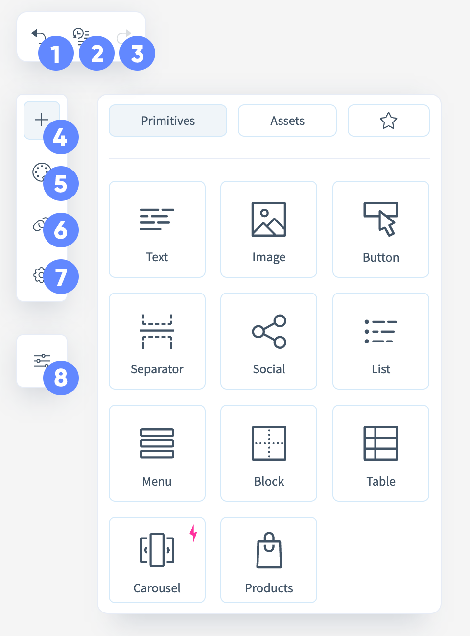
- Undo — cancels the last performed action;
- Action history — opens the list of all changes and allows you to revert to any previous version;
- Redo — repeats the previously undone action;
- Add — opens the menu of primitives and ready-made blocks for inserting into the template;
- Styles — panel for customizing the design of the template;
- Link Map — displays all links used in the template for review and editing;
- Parameters — theme and preheader settings for the email;
- Options — general editor parameters (interface theme and property panel position).
Editing Area
The main part of the editor where the email is assembled. Blocks can be dragged here from the toolbar. Each element is outlined and can be modified directly.
Blocks and Elements
Block
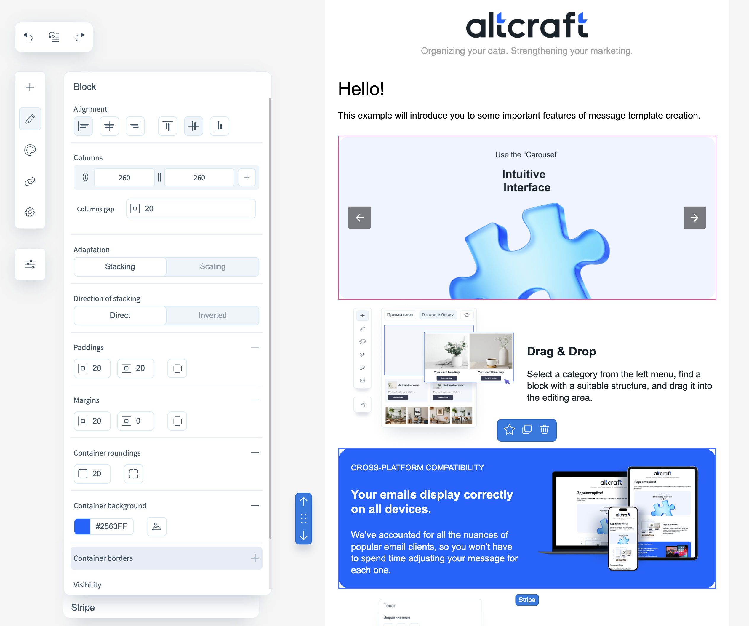
For a content block, the following parameters can be configured:
- Alignment — alignment of the block to the left, right, or center of the email;
- Columns — set the number of columns, their width, and spacing;
- Adaptation — available if the block has more than one column. Defines how the columns appear on mobile: shrink in size or stack vertically, maintaining size;
- Direction of stacking — sets the column order if vertical stacking is selected;
- Paddings — inner spacing between block content and its borders;
- Margins — outer spacing between the block’s borders and the email layout;
- Container roundings — controls corner rounding;
- Container background — choose a background color or upload an image;
- Container border — set the color, thickness, and border style;
- Visibility — determines visibility in different versions of the email (HTML/AMP/everywhere, desktop/mobile).
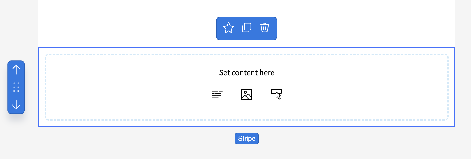
You can add content to an empty block by clicking the respective icons inside the element:
Column properties can also be customized:
- Alignment;
- Padding;
- Column background;
- Column rounding;
- Column border;
- Column size.
For the row containing the block, you can configure:
- Alignment;
- Background;
- Content width;
- Content rounding;
- Content borders;
- Padding.
Some row parameters affect the appearance of the entire email.
Text
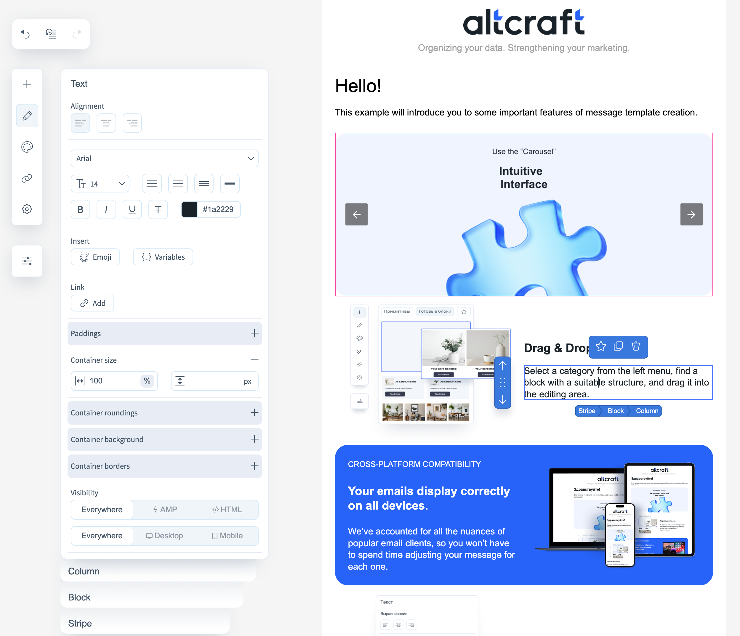
Configurable properties for a text block:
- Alignment of text within the container;
- Font, size, style, and color;
- Insertion of emojis and variables (variables supported by popular email services);
- Insert links in text;
- Padding inside the block;
- Size, rounding, background, and border of the container;
- Visibility — determines block visibility in different email versions (HTML/AMP/everywhere, desktop/mobile).
Image
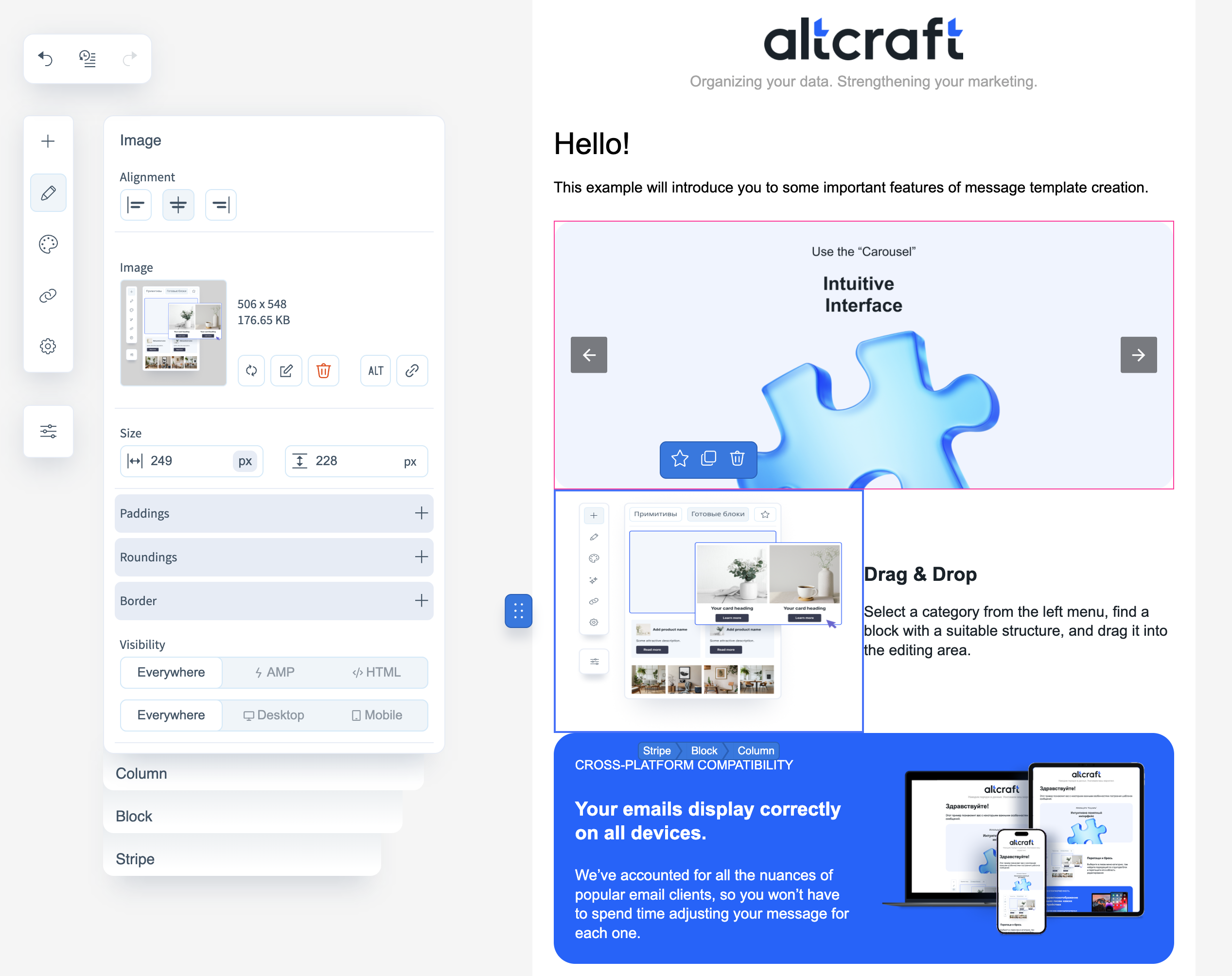
Configurable properties for an image block:
- Alignment of the image within the container;
- Image size;
- Padding within the block;
- Container rounding and its borders;
- Visibility — determines block visibility in different versions of the email (HTML/AMP/everywhere, desktop/mobile).
Button

Configurable properties for buttons:
- Alignment of the button within the container;
- Link to follow when clicked;
- Font, size, and color of the text;
- Background of the button (you can upload an image);
- Size, style, and corner rounding of borders, as well as padding within the container;
- Visibility — determines block visibility in different versions (HTML/AMP/everywhere, desktop/mobile).
Separator
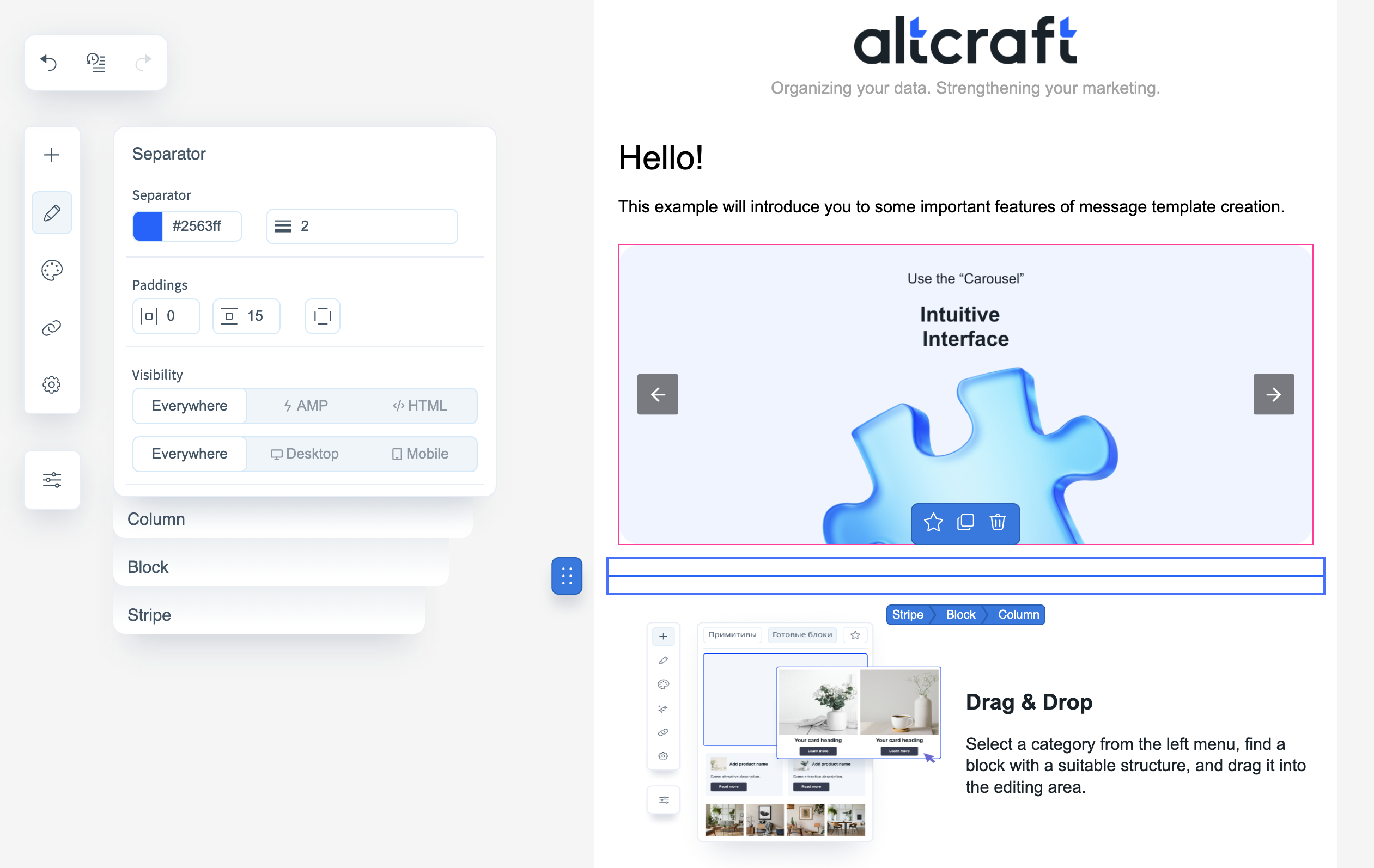
A separator is an empty block with a horizontal line inside. Configurable options:
- Color and thickness of the separator;
- Padding inside the container;
- Visibility — determines visibility in different email versions (HTML/AMP/everywhere, desktop/mobile).
Social Networks
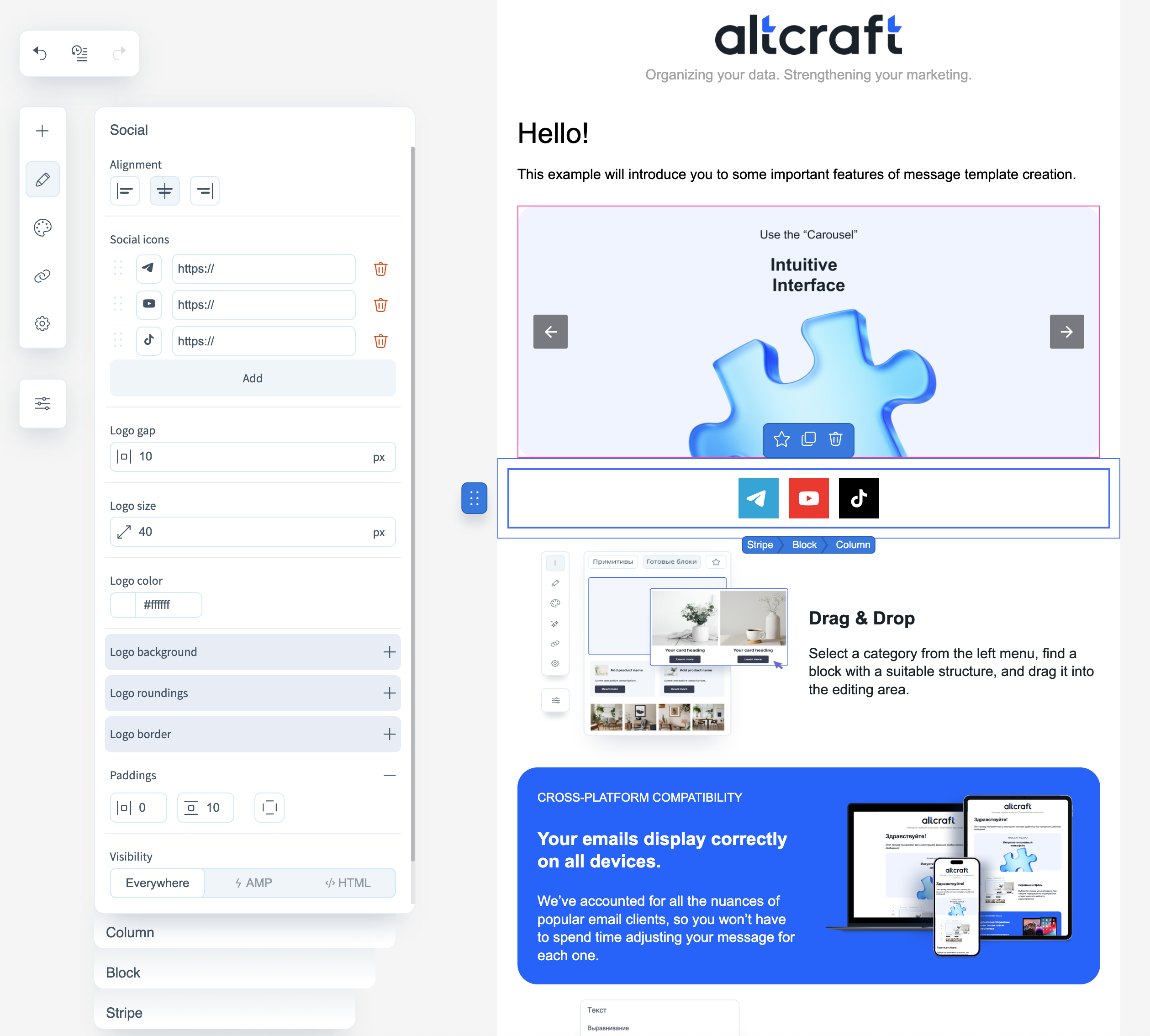
Social Networks — a block with clickable icons of popular social networks. Configurable options:
- Alignment within the container;
- Social network settings — add or remove icons, change their order, and configure click links. You can also set individual background and logo colors for each network;
- Spacing between logos, logo size;
- Logo color and background color — customizable per network;
- Padding inside the container, corner rounding, and borders of logos;
- Visibility — determines block visibility in different versions (HTML/AMP/everywhere, desktop/mobile).
List
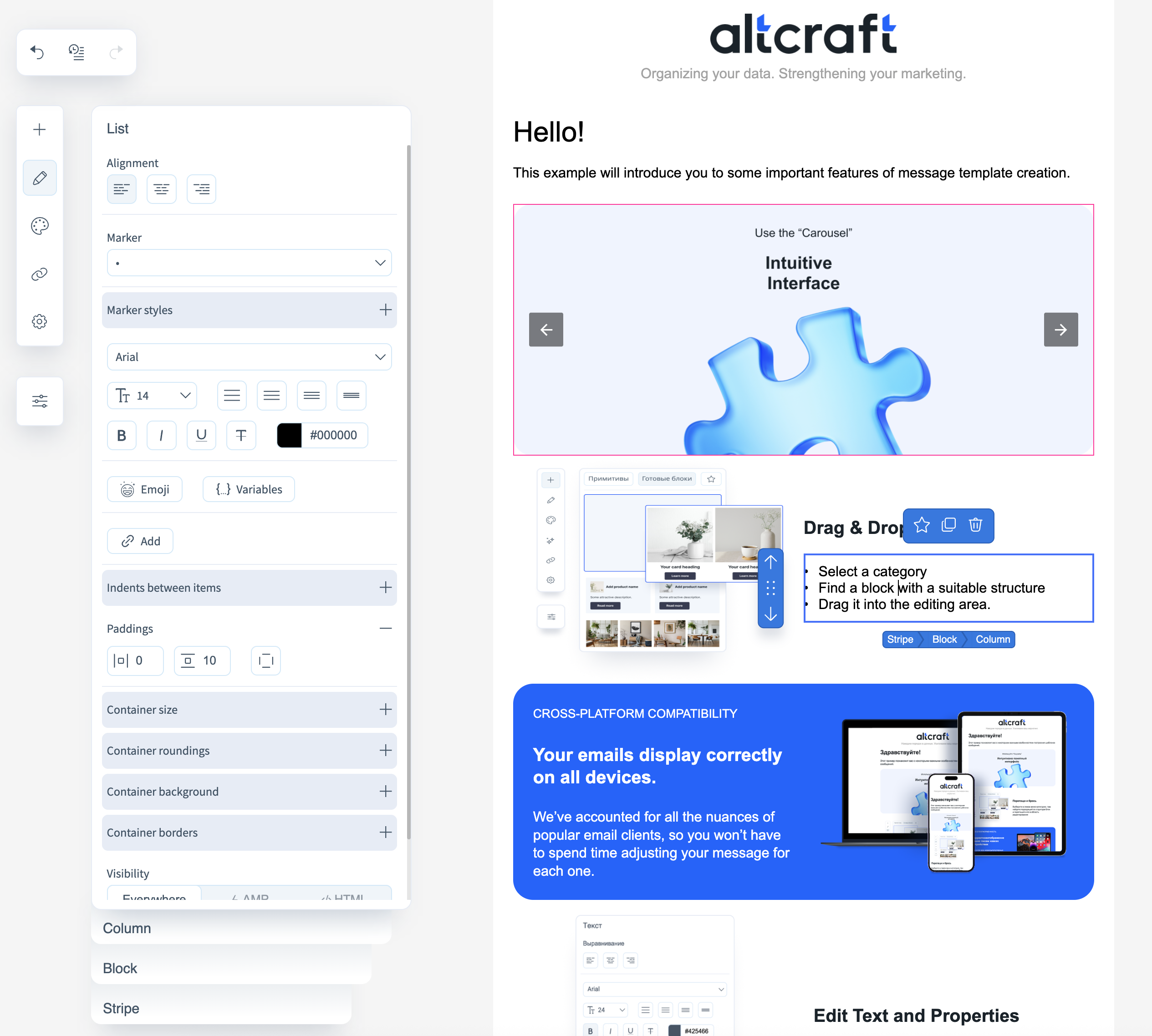
Configurable properties for lists:
- Alignment within the container;
- Marker style, as well as size, color, and font (if a numeric marker is selected);
- Container size and background, border style and rounding, plus padding inside the container;
- Text properties — size, color, font, style, and insertion of variables and emojis. Links can also be inserted into the text;
- Visibility — determines visibility in different versions (HTML/AMP/everywhere, desktop/mobile).
Menu
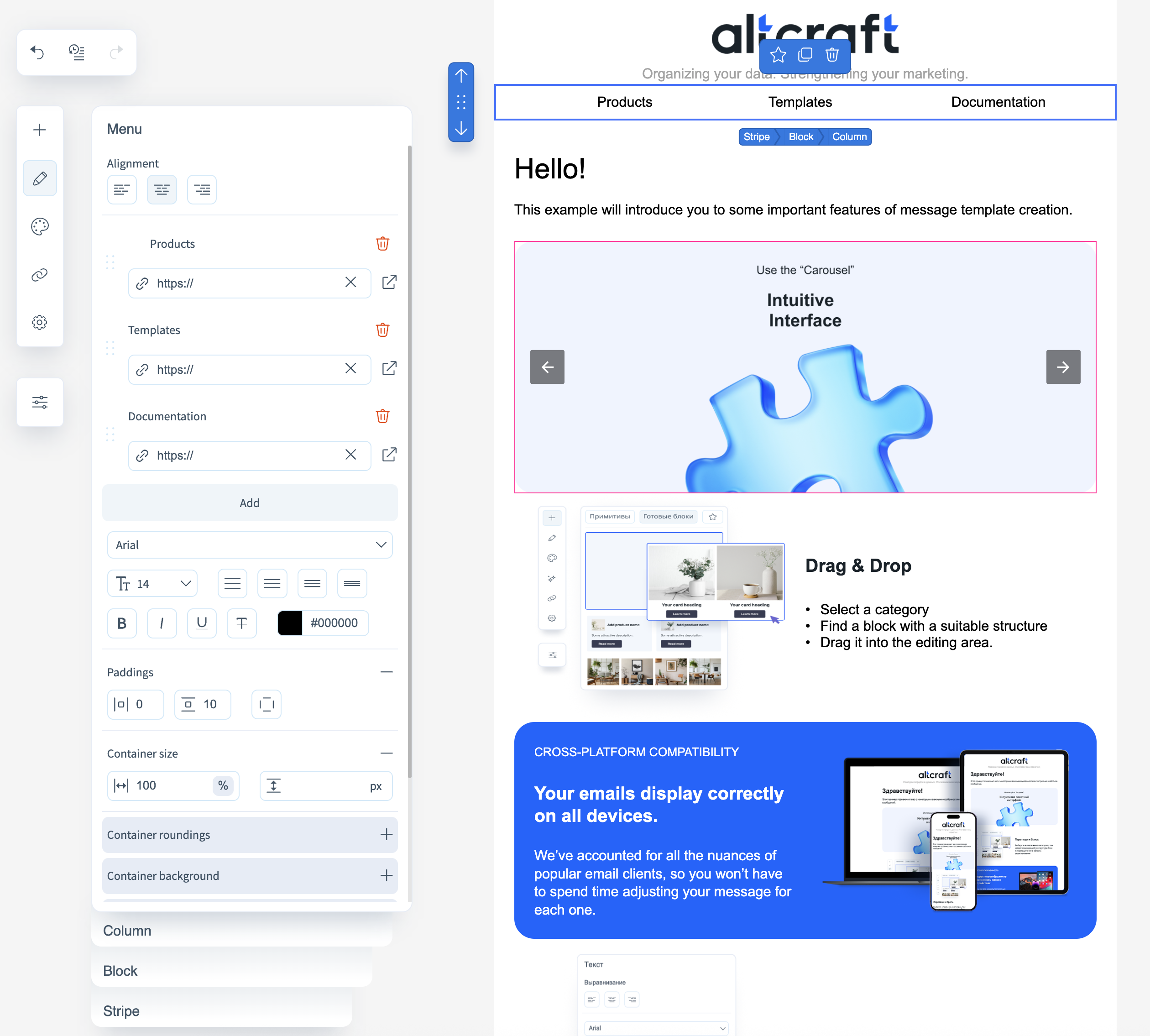
Configurable properties for menus:
- Alignment within the container;
- Menu items and their order — you can specify both the text and a link for each;
- Text properties — size, color, font, style;
- Container size, background, border style, rounding, and padding;
- Visibility — determines visibility in different versions (HTML/AMP/everywhere, desktop/mobile).
Table
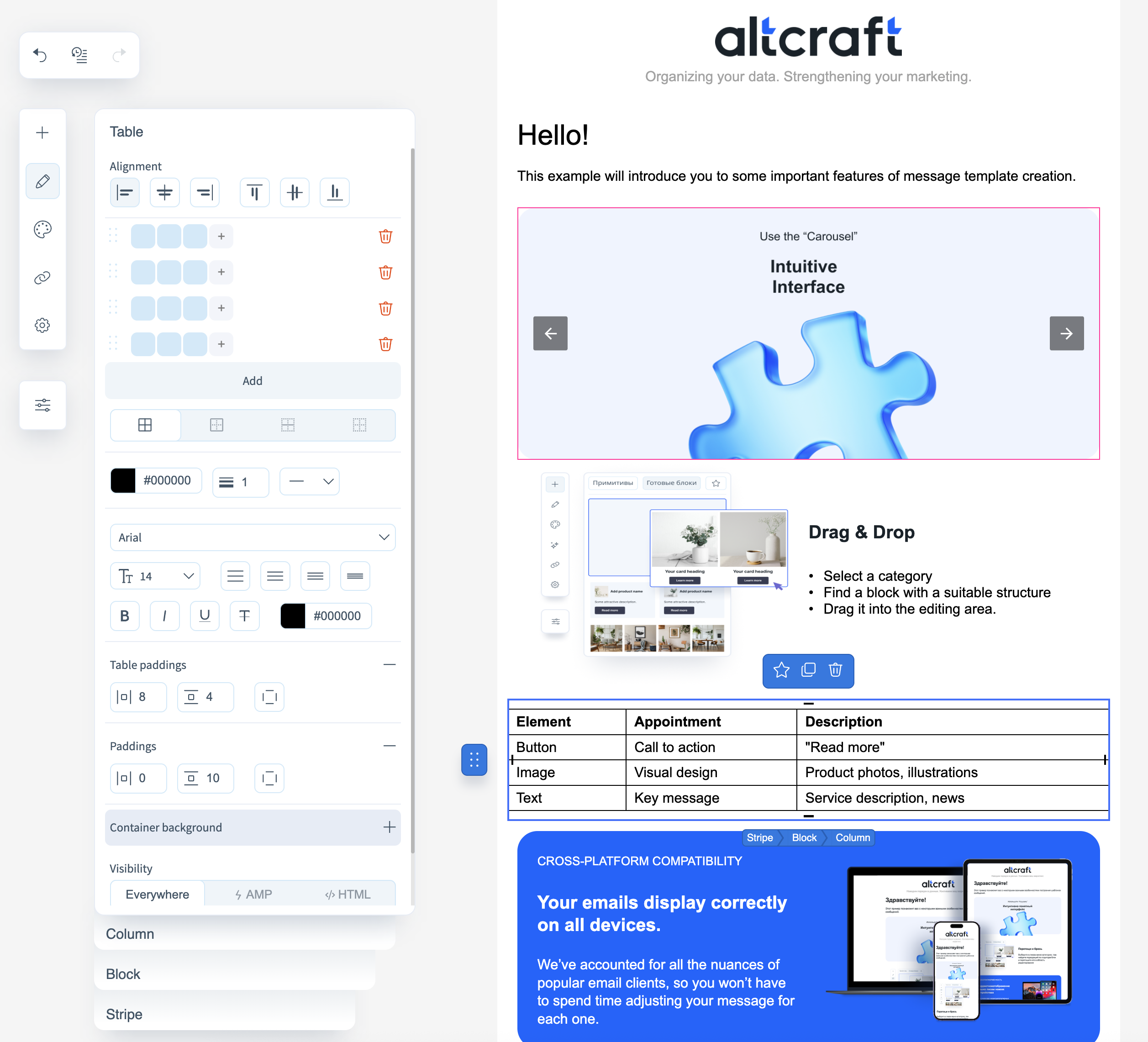
Configurable properties for tables:
- Text alignment within the table;
- Table size and border style/thickness between cells;
- Text properties — size, color, font, style;
- Padding inside cells;
- Padding inside the container;
- Container background;
- Visibility — determines visibility in different versions (HTML/AMP/everywhere, desktop/mobile).
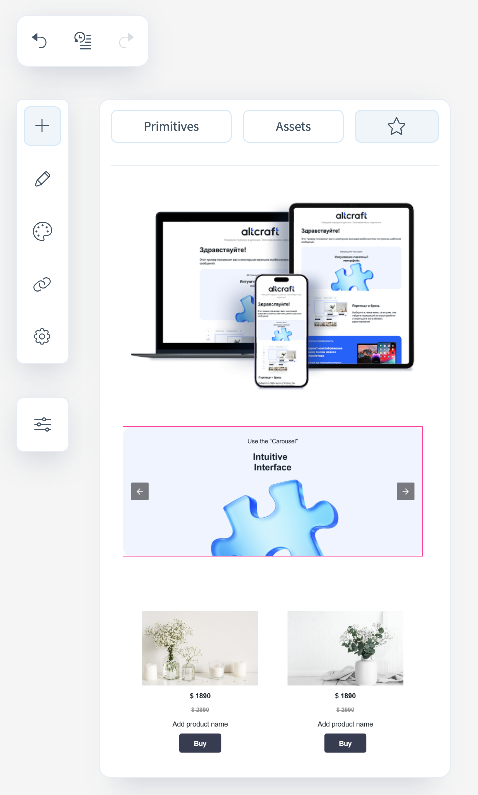
Carousel
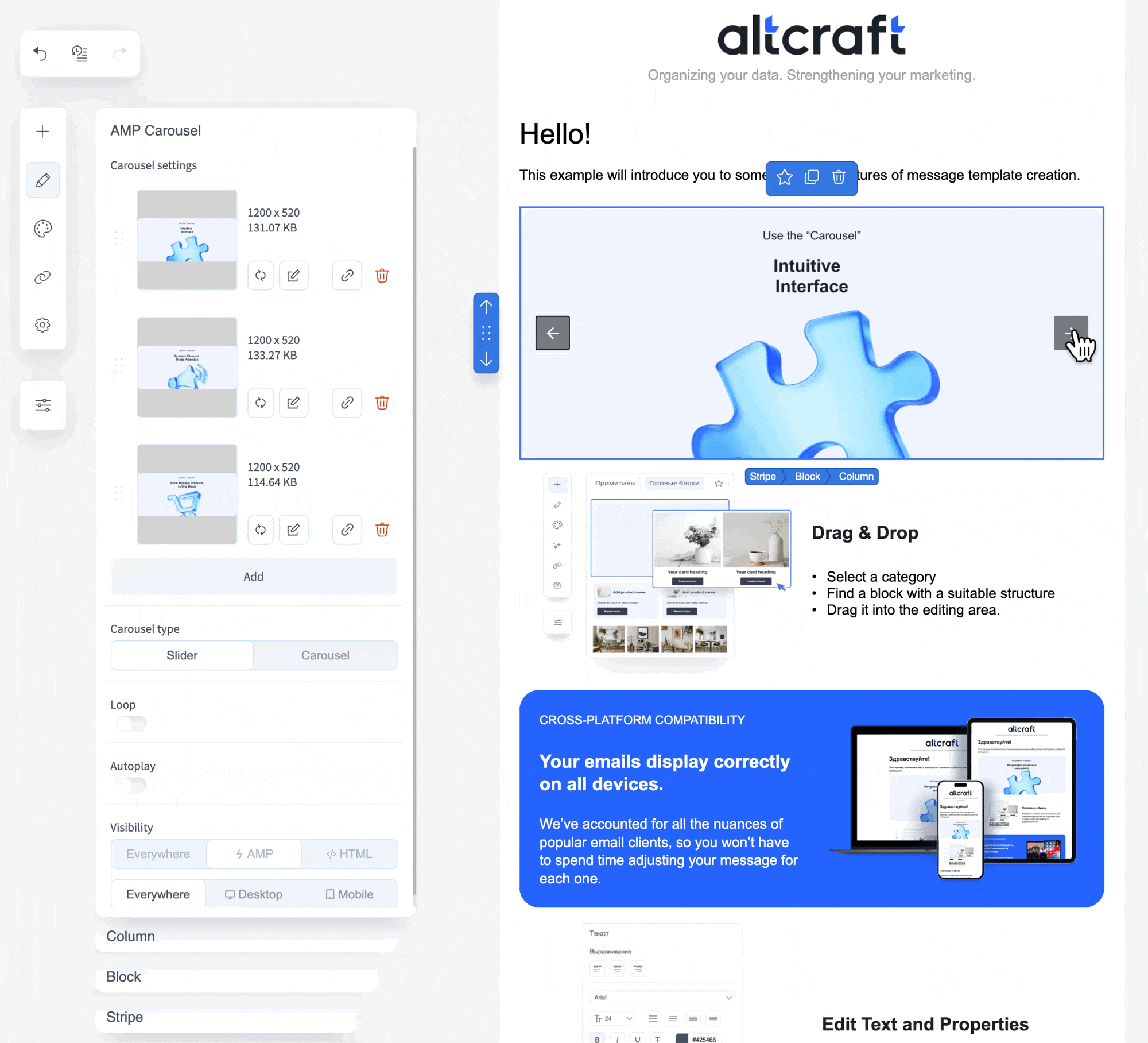
Carousel — an AMP component consisting of several scrollable images. Configurable options:
- Images included in the carousel. You can upload from your device, choose from the Pixcraft gallery, or add click-through links;
- Carousel type — slider carousel (displays one image) or classic carousel (displays multiple images);
- For slider carousels, you can enable looping and auto-scroll after a set delay;
- For classic carousels, configure the height of the images;
- Visibility — determines visibility in different versions (desktop/mobile). Since this is an AMP component, it will not display in HTML emails.
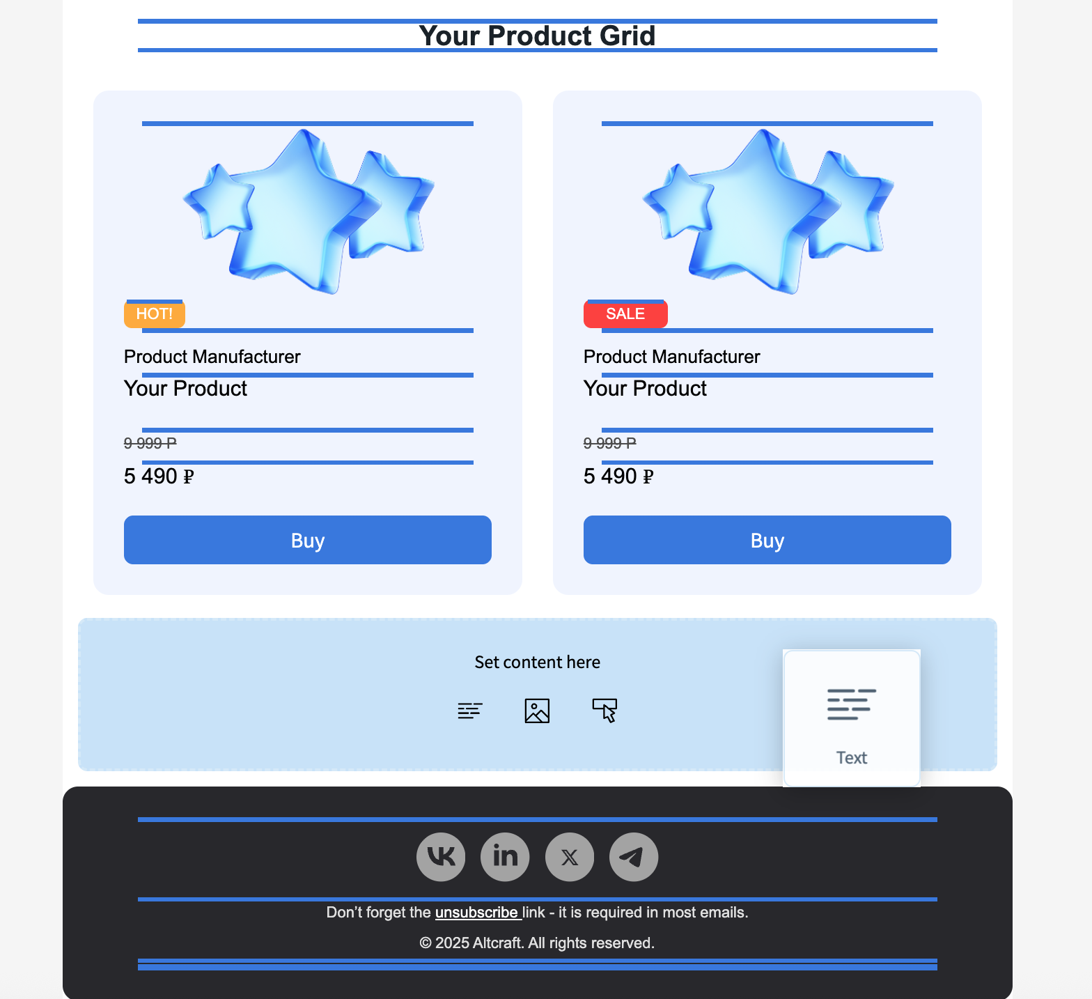
Products
The Products block is used for dynamically generating product sections in newsletters — for example, selections of popular, promotional, or recommended products synchronized with up-to-date data from the CDP.
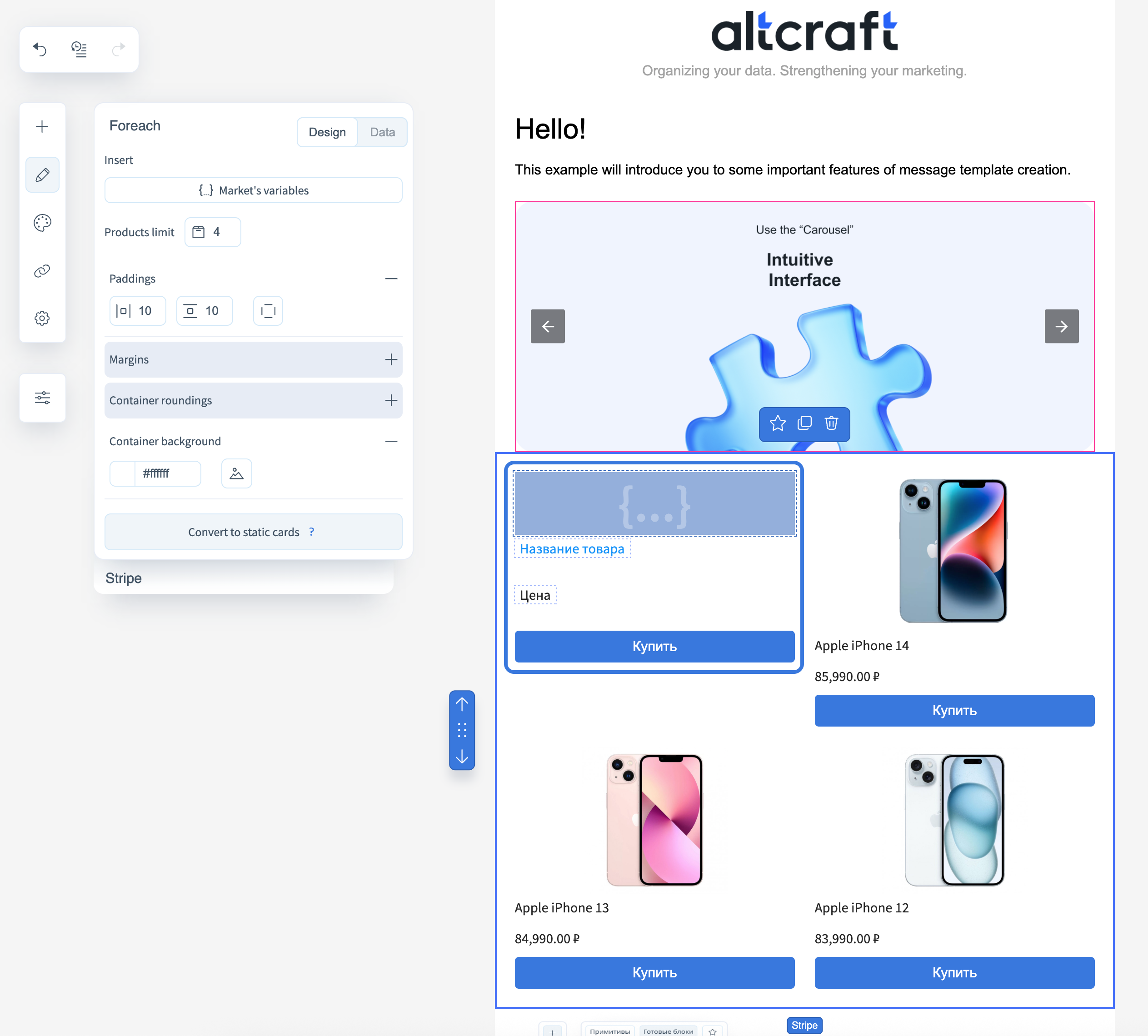
Design
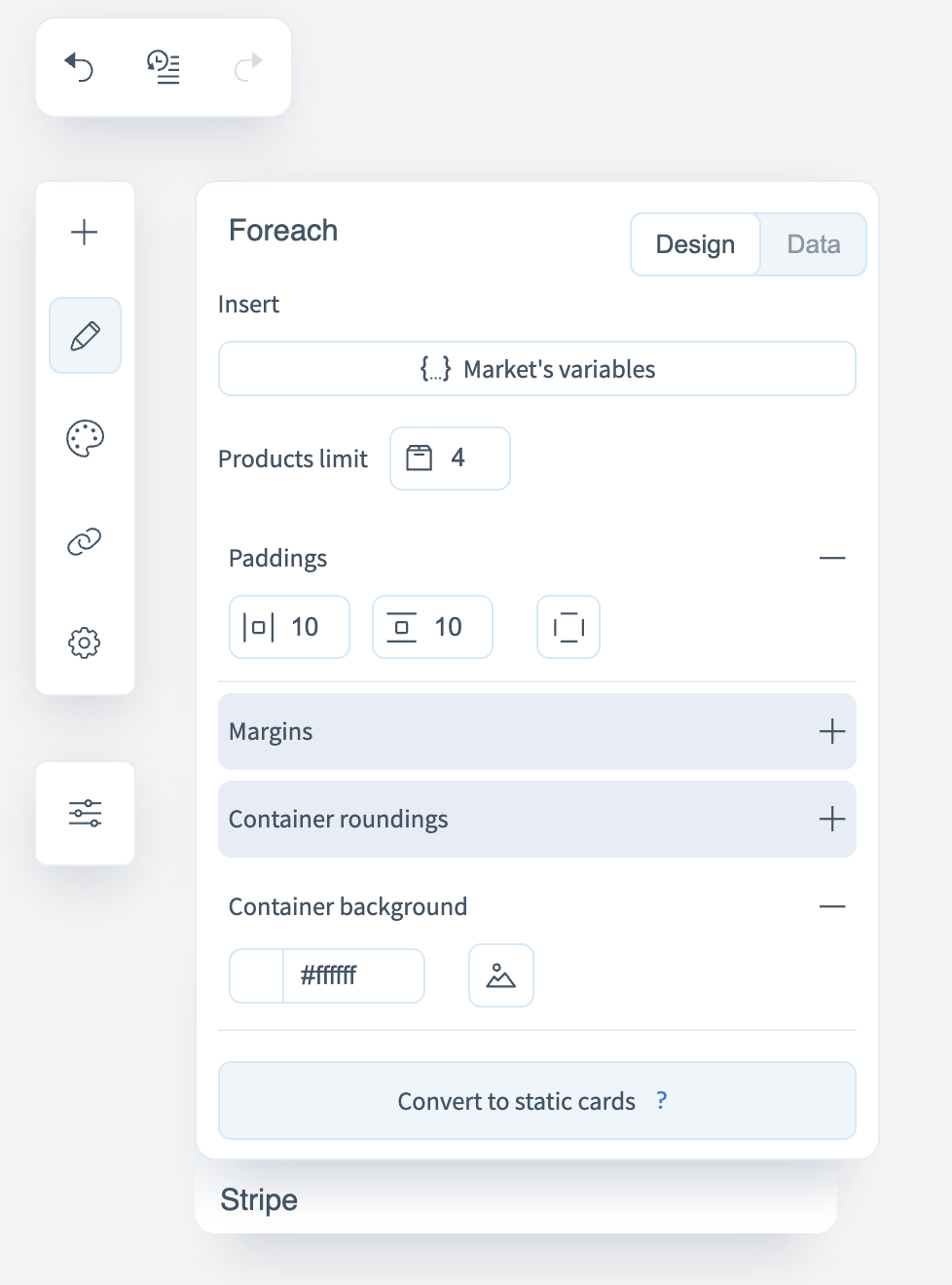
The Design tab controls the visual appearance of product cards and includes the following properties:
- Market variables — define which elements are displayed in the card: name, price, image, button, etc.
- Number of products — sets how many product cards are displayed per row.
- Padding — defines inner and outer spacing around the cards.
- Container rounding — sets the corner radius of the cards.
- Container background — defines the color or image of the card background.
All changes made in this tab are applied to all cards within the block.
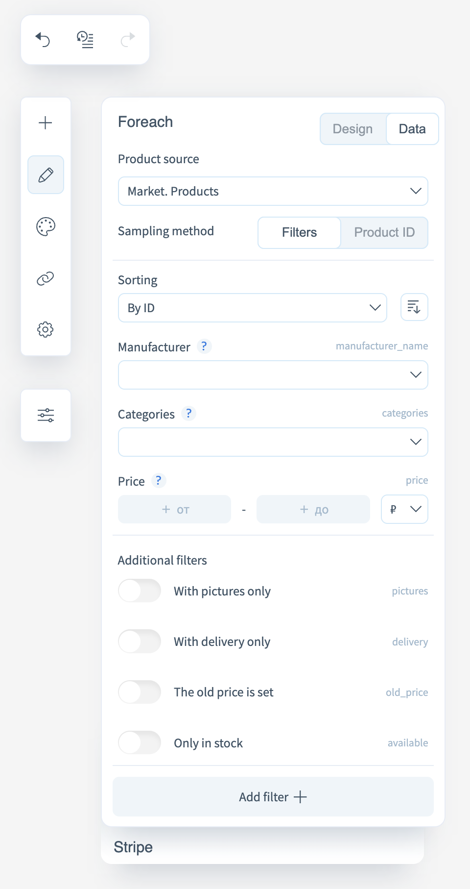
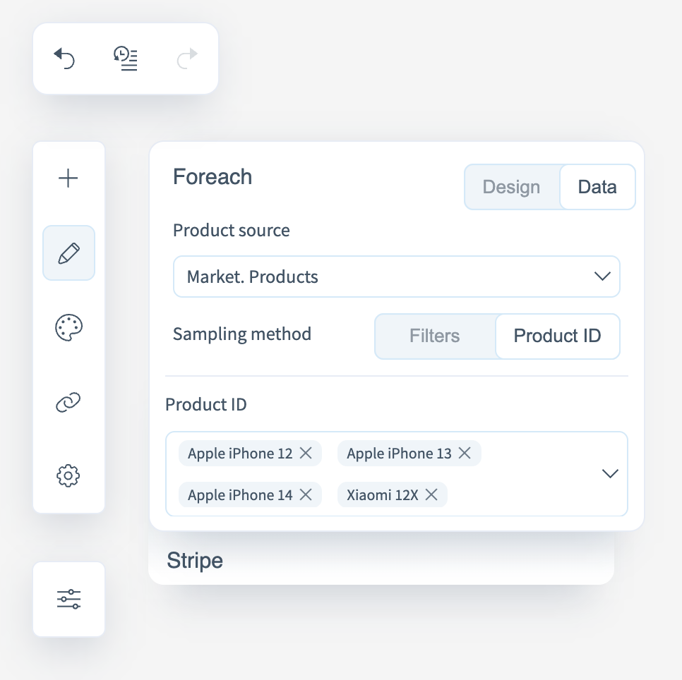
Data
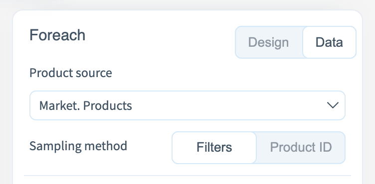
The Data tab is used to configure product sources and data selection parameters from Altcraft CDP. It includes the following settings:
-
Source — select the data source from which products are loaded.
-
Selection method — defines how products are retrieved:
- Filters — dynamic product selection mode based on defined criteria (sorting, manufacturer, categories, price). Additional filters are available: only with images, only with delivery, has old price, in stock only.
- Product ID — manual selection mode by specifying specific product identifiers. Suitable for displaying fixed product sets that do not depend on inventory updates.
Assets
A collection of pre-designed blocks for various purposes. Using them, you can assemble a basic email layout in just a minute.
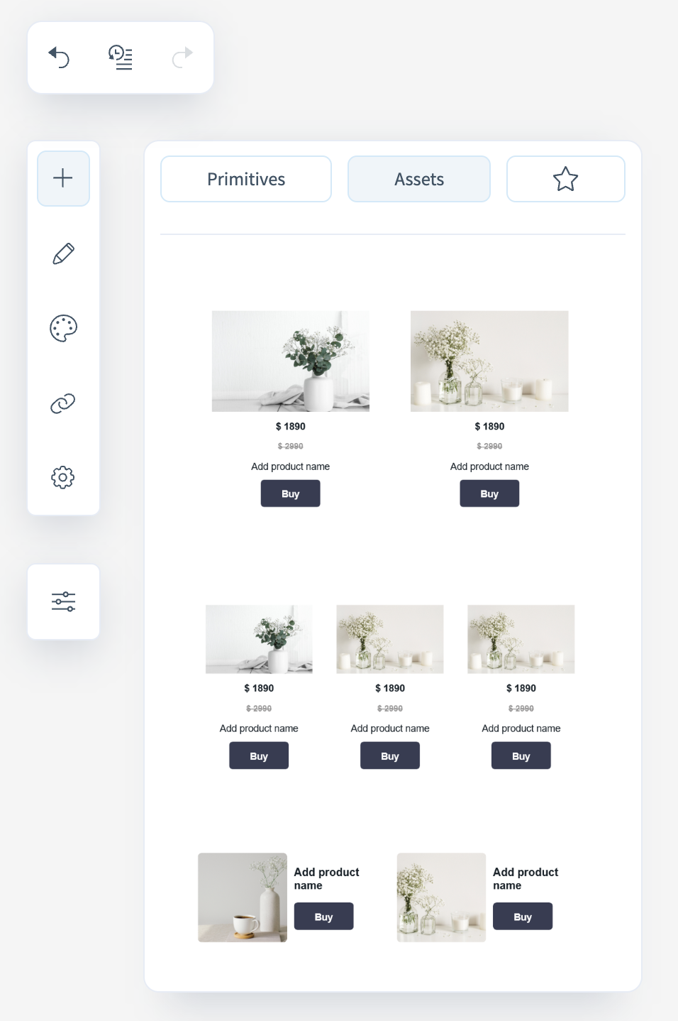
Saved Blocks
If you frequently use a specific component or want to apply consistent styled blocks across different emails, you can save it for later use.
To save a block, click the "star" icon.
After saving, it will always be available in the editor on the respective tab (to the right of the "Ready-Made Blocks" section).
Styles
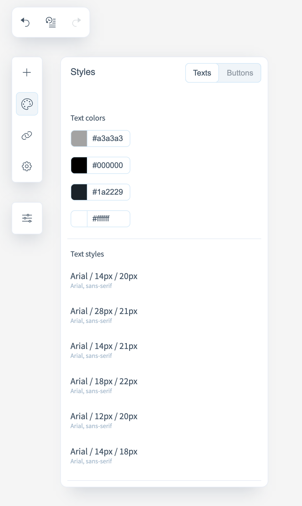
To maintain visual consistency and follow a unified design system, use the Styles section. Here you can monitor the colors and text styles used within blocks and buttons.
In the "Buttons" section, you can view a list of all buttons and their styles. From this menu, you can also modify fonts, text colors, and visual button properties:
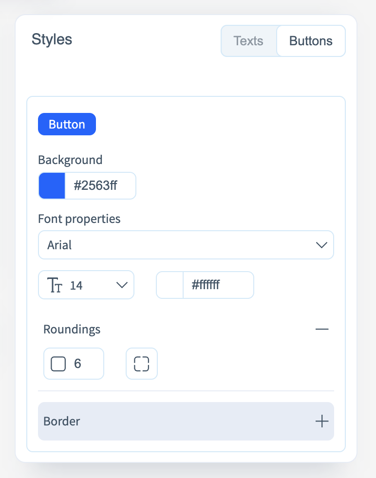
Next to each style and color, there’s a button that takes you to the corresponding element in the email where that style is applied.
Link Map
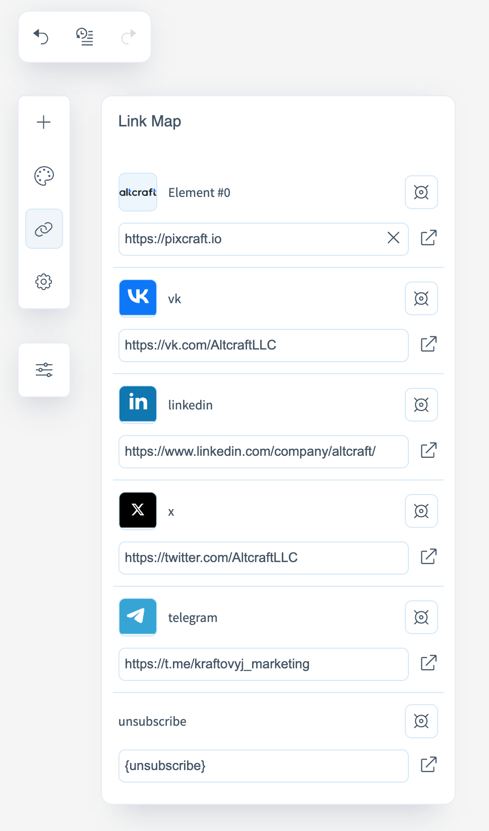
This section displays all links used in the current email. For each link, the element it’s applied to is indicated.
The following control buttons are available:
- Open Link — opens the link in a new browser tab to check the destination;
- Find Element — highlights the element in the email where the link is used;
- Delete — removes the link from both the list and the corresponding element on the canvas.
Parameters
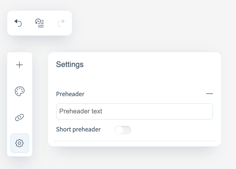
In this section, you can adjust the editor’s appearance and layout according to your preferences.
- Interface theme — choose between light and dark modes.
- Property panel position — defines where the properties panel appears. You can place it on the left or on the right, depending on your preference.
Working with the template after creation
After creating a template and applying the changes, you will have several actions available to you:
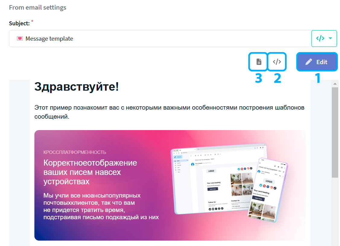
-
Edit button - allows you to return to the editor and make changes to the template;
-
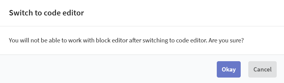
Show template code button - shows HTML code of the created template:
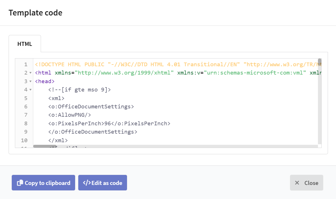
You can go to the code editor from the window that appears by clicking the "edit as code" button, but you will no longer be able to edit your template in the block editor.
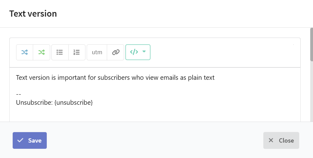
- Edit text version button — demonstrates the text version of your template, it also allows to edit it.