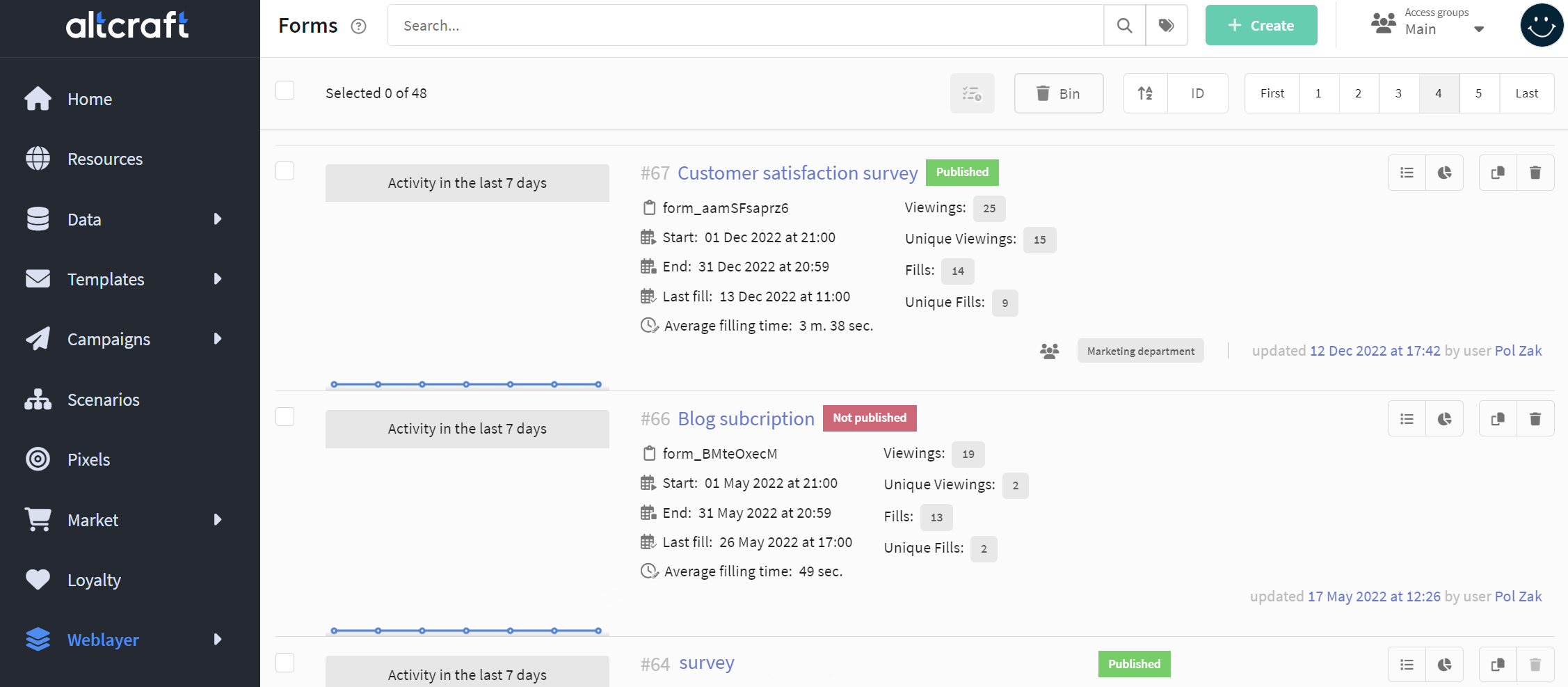
Create a form
Forms allow you to collect information from users: contact details, feedback, requests, event registrations, and much more. Once created, a form can be embedded on a website, sent via email, or used in newsletters.
To create a form, go to Forms in the main menu and click the Create button:
General settings
The General tab contains the main form settings: name, description, publication options, and additional features. Here you set the basic parameters of the form before moving on to its content and design.
Key features:
- Configure the name, description, and form identifier
- Manage publication and scheduling
- Configure the final page after form submission
- Restrict repeat submissions
- Add custom code for customization
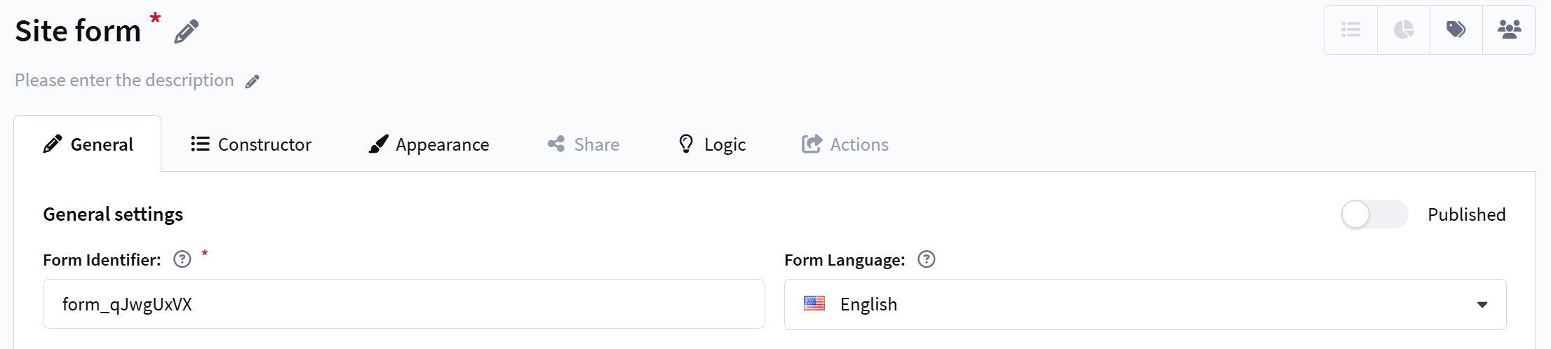
You can learn more about general settings in this article.
Form constructor
The Constructor tab is used to build the form structure — here you add fields, configure questions and answers, and manage form pages. This is the main tool for creating the form content.
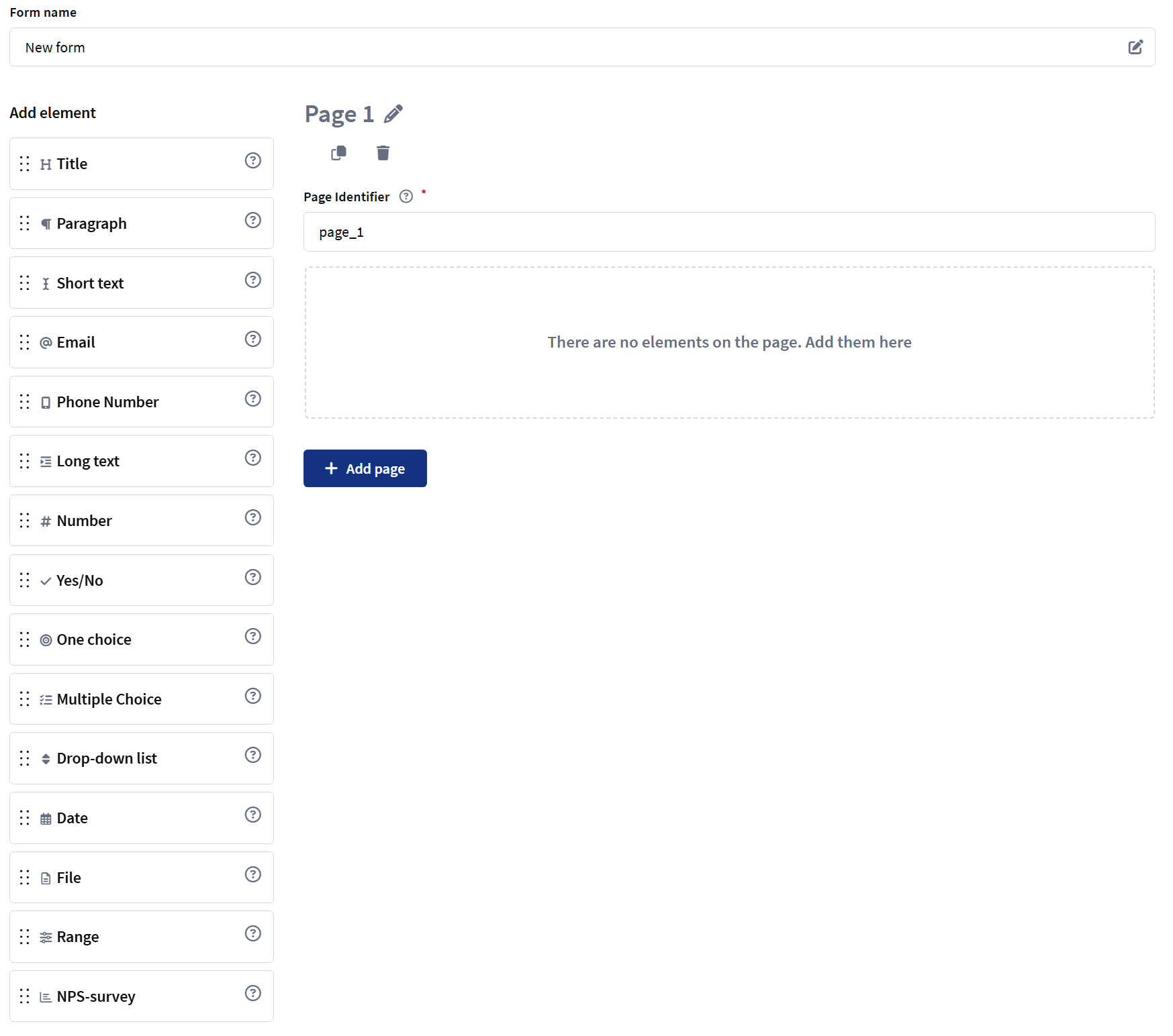
To add a selected field, simply drag it from the left panel. The following field types are available:
| Field Type | Description |
|---|---|
| Title | A text header row |
| Paragraph | A text block for information |
| Short text | A field for a short answer |
| An email input field with validation | |
| Phone number | A phone number input field |
| Long text | A multi-line text field |
| Number | A field for numeric values |
| Yes/No | A toggle for consent |
| One choice | Radio buttons for selecting a single option |
| Multiple choice | Checkboxes for selecting multiple options |
| Drop-down list | A dropdown list of options |
| Date | A date picker field |
| File | File upload (up to 20 MB) |
| Range | A rating scale (stars, numbers) |
| NPS Survey | A field for NPS testing |
You can learn more about the form constructor in this article.
Appearance
The Appearance tab allows you to customize the form's visual design — colors, fonts, element layout, and button styles. Here you can adapt the form design to match your website or brand style.
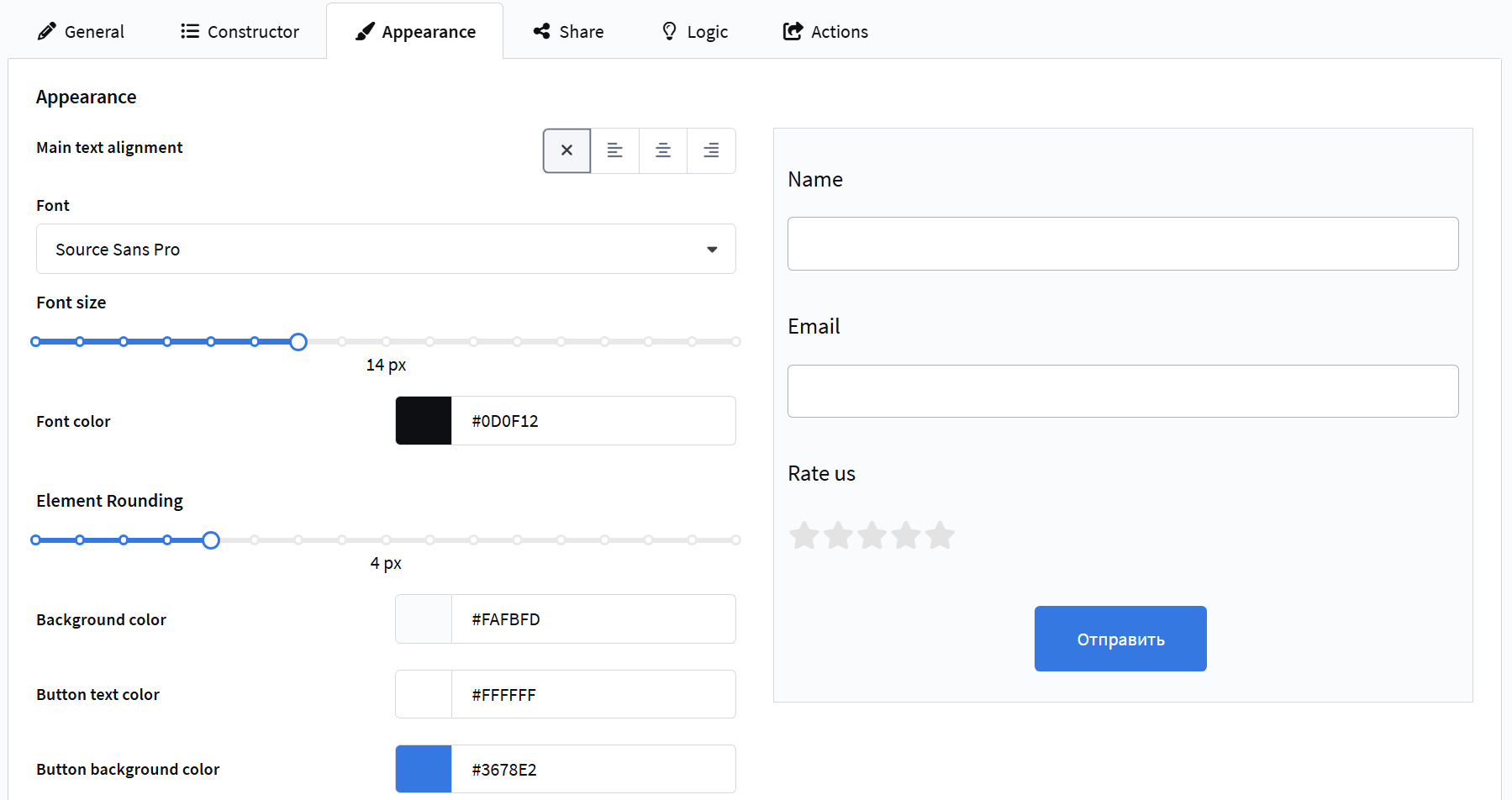
Main settings:
- Fonts — choose the font style and size
- Color scheme — configure text, background, and element colors
- Alignment — set the form element layout
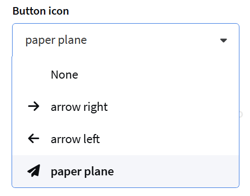
Button styling:
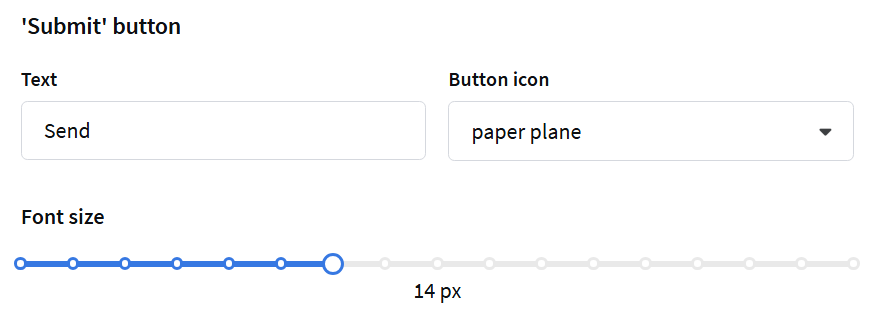
For each button, configure the text, font size, and icon:
You can learn more about form appearance in this article.
After saving the form
After configuring all the parameters, you need to save the form. Only then will additional tabs for configuring actions and publication become available.
Actions
The Actions tab configures automated processes after form submission — importing data into the database and sending notifications. Here you define what happens to the information after the form is submitted:
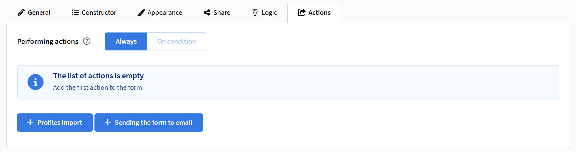
- Profiles import — upload data to the database
- Send email notifications — email alerts about form submissions
Learn more about the Actions tab.
Share
The Share tab provides access to codes and links for publishing the form on your website. Here you get ready-made options for embedding the form:
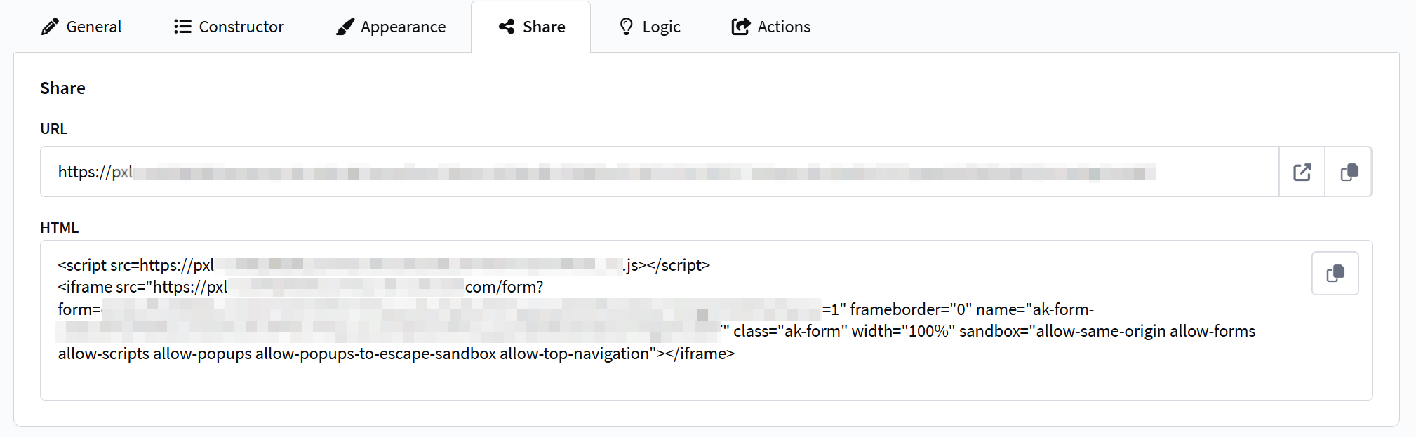
- URL — a direct link to the form
- HTML code — code for embedding on the website
- Embedding parameters — as an iframe or popup window
Detailed information can be found in this article.