Form constructor
The second tab Constructor is used to configure the form structure and its fields. Here you can set up form pages, add and configure fields — define their type, required status, visibility, and display logic:
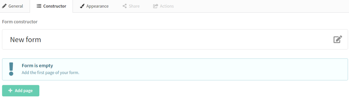
- The right side of the screen displays the form pages and their elements.
- The left column shows the element types that can be added to the form.
Working in the constructor starts with creating a page — click Add page:
Elements and their description
Title
Title is a text element where you can specify the main topic of your form.

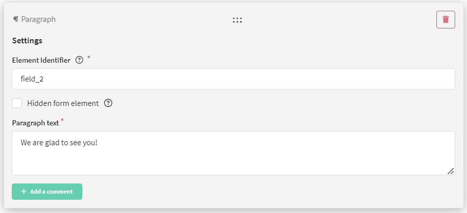
Paragraph
Paragraph is a text element. It can contain information that should be displayed in the form.
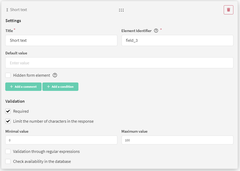
Short text
Short text is a text field where you can ask a question with a short answer. For example, the client's first or last name.
For this field, you can set a title, a default value, and configure element visibility and data validation.
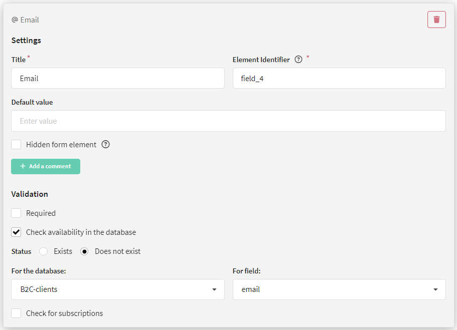
Email
Email is a field where you need to specify an email address.
For this field, you can set a title, a default value, and configure element visibility and data validation.
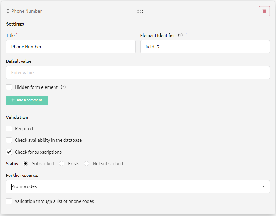
Phone number
Phone number is a field where you can specify a phone number.
For this field, you can set a title, a default value, and configure element visibility and data validation.
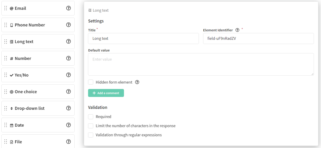
Long text
Long text is a text field where you can ask a question with a long answer, for example, feedback about a product or event.
For this field, you can set a title, a default value, and configure element visibility and data validation.
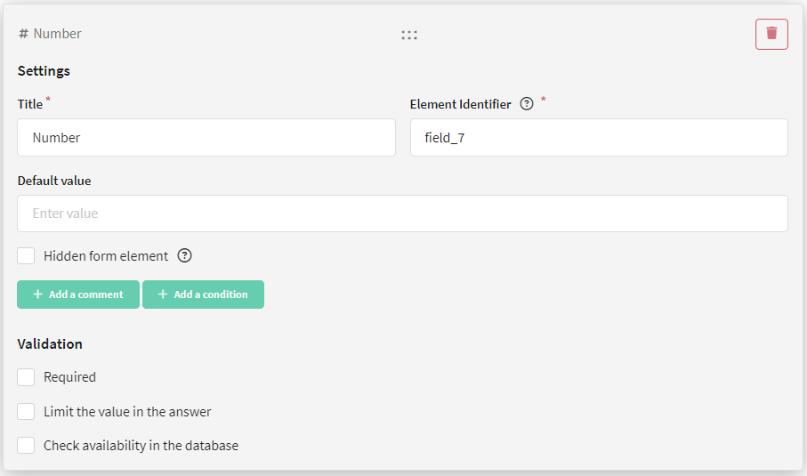
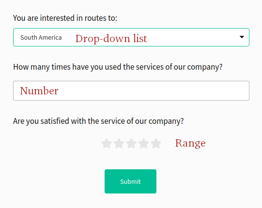
Number
Number is a field where you can ask a question with an answer in the form of an integer or fractional number, for example, age.
For this field, you can set a title, a default value, and configure element visibility and data validation.
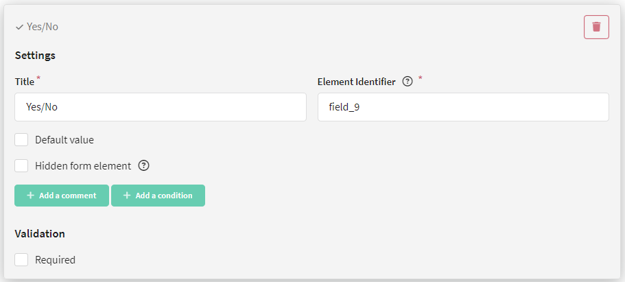
Yes/No
Yes/No is a field where you can ask a question to obtain consent, for example, to receive email newsletters.
For this field, you can set a title, a default value, and configure element visibility.
If you check the Default value field, the answer "yes" will be selected by default in the form.
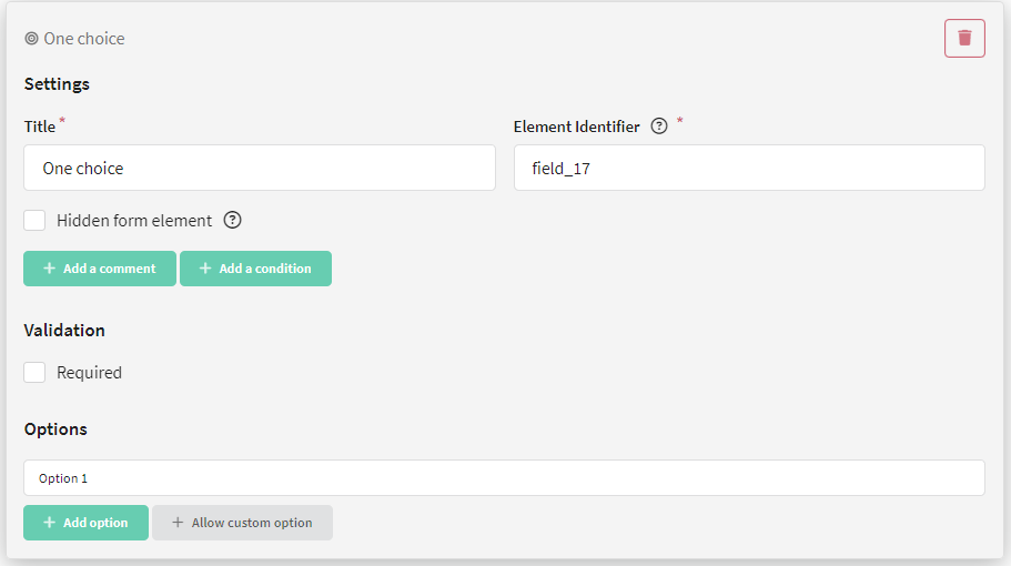
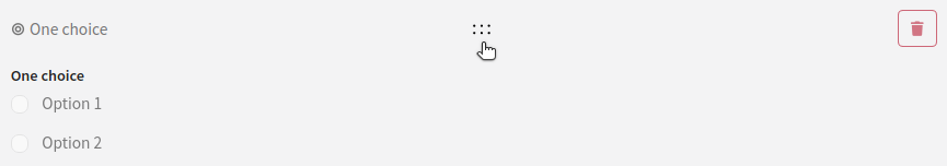
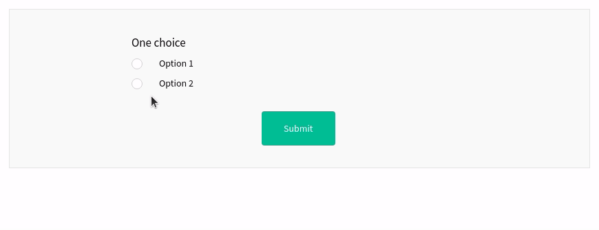
One choice
One choice is a field where you can offer to choose one of several answer options. For example, product color — red or blue.
For this field, you can set a title, answer options, and configure element visibility and data validation.
Click the Add option button and enter a value. The number of options is unlimited.
You can allow the user to enter their own answer by clicking the Allow custom option button.
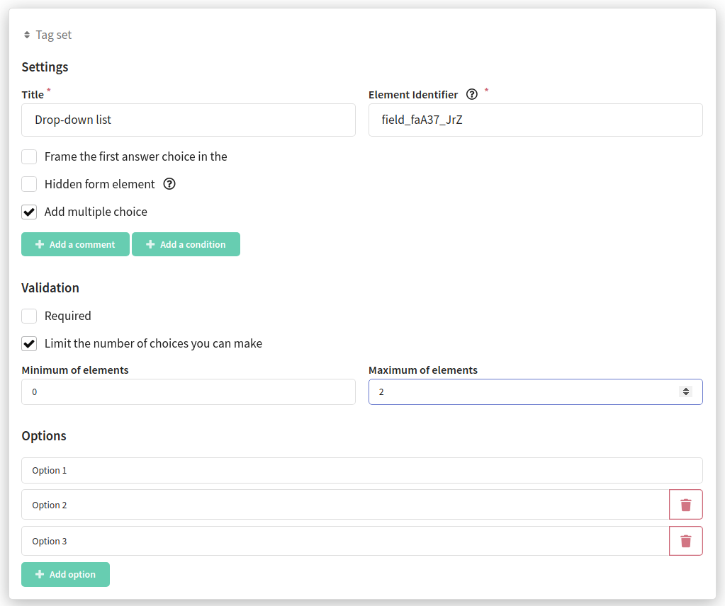
Multiple choice
This element allows you to select several answer options from the proposed ones. Use the Add option button to add possible answers.
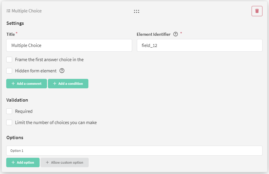
The element can be made required, the number of options to select can be limited, and you can also frame the first answer choice in the field:
Drop-down list
Drop-down list is a field where the user needs to select one option from a dropdown list.
For this field, you need to set a title and answer options. Click the Add option button and enter a value. The number of options is unlimited.
You can allow the user to enter their own answer by clicking the Allow custom option button. When this option is selected, an additional field will open for text input.
In addition, you can frame the first answer choice in the field by clicking the corresponding button.
You can also configure element visibility and data validation.
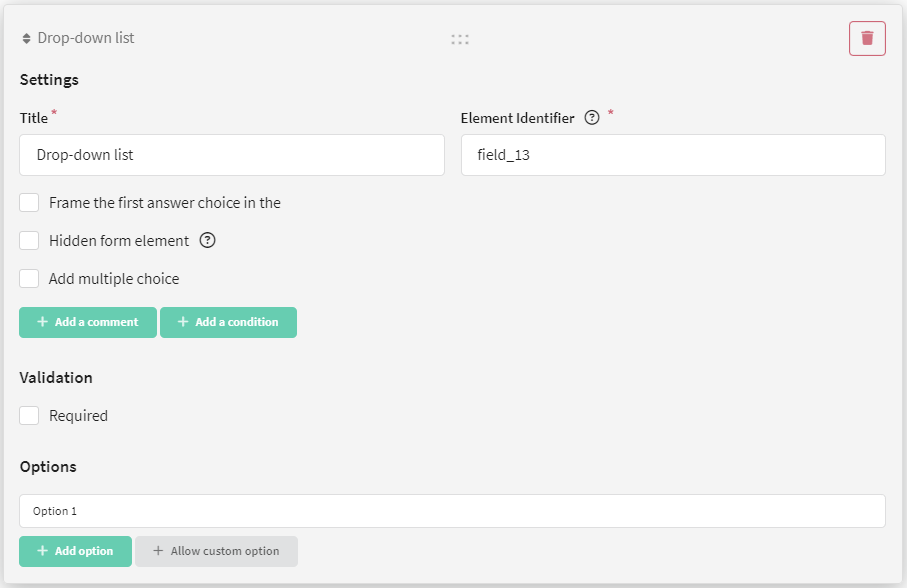
If you want to allow the user to select multiple answer options, click Add multiple choice.
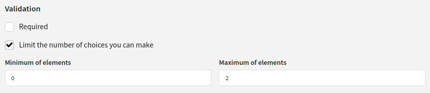
Note that when multiple choices are enabled, a new validation type appears — Limit the number of choices you can make.
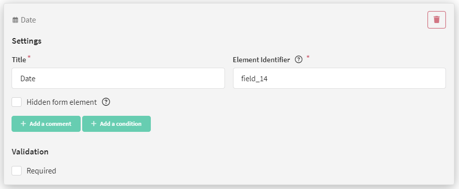
Date
Date is a field where you are asked to specify a date, for example, the client's birthday.
For this field, you can set a title, and configure element visibility and data validation.
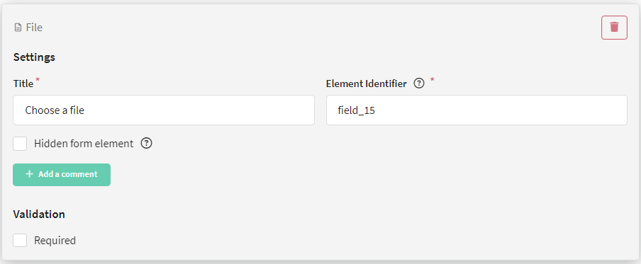
File
File is a field where files can be attached to the form, for example, a photo. The maximum file size is 20 MB.
For this field, you can set a title, and configure element visibility and data validation.
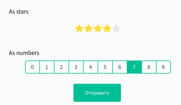
Range
Range is a rating selection scale. For this field, you can set a title, and configure element visibility and data validation.
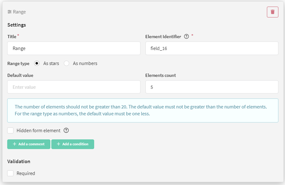
Additionally, you can choose the range type: as stars or as numbers.
You can also specify the number of elements (for example, 5 stars or 10 numbers).
If you choose numbers as the range type, note that the count starts from 0.
NPS Survey
NPS Survey is a test to obtain the Net Promoter Score. For this field, you can set a title, configure element visibility and data validation, as well as set labels for the maximum and minimum scores.
You can learn more about what NPS testing is and how to create it in this article.
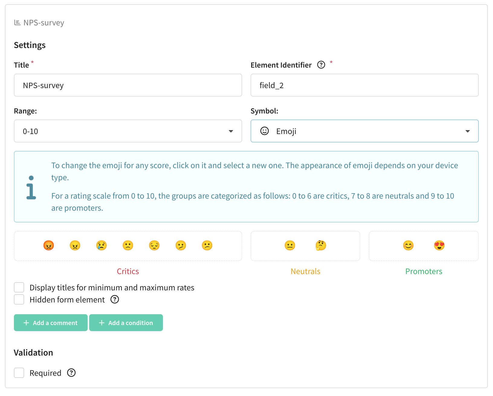
You can select the symbol type: as stars, hearts, emoji, or as numbers.
For the scale, you can also specify the size — 0 to 5, 0 to 10, 1 to 5, and 1 to 10.
You can drag and drop form elements, easily arranging them in the order you want. When you hover over an element, a cluster of dots appears at the top. Hover over them, hold down the left mouse button, and drag the element wherever you wish.
Form field validation
Most fields have one or more validation types:
| Validation | Form field |
|---|---|
| Required | Short text, email, phone number, long text, number, one choice, drop-down list, date, file, range |
| Limit the number of characters in the response | Short text, long text |
| Validation through regular expressions | Short text, long text |
| Check the availability in the database | Short text, email, phone number, number |
| Check for subscriptions | Email, phone number |
| Validation through a list of telephone codes (list the telephone codes allowed in the form using the + symbol) | Phone number |
| Limit the value in the answer | Number |
| Limit the number of choices you can make (specify the minimum and maximum number of options the user can select) | Drop-down list |
The validation types Check the availability in the database and Check for subscriptions allow you to restrict form submissions for certain users. For example, you can allow only registered users to submit, or prevent the same user from resubmitting a form.
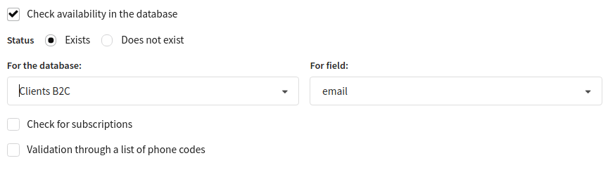
Check the availability in the database
At the moment of form submission, the platform will check if the profile of the person who filled out the form exists in the database. If a profile with the specified data does not exist, the user will not be able to submit the form.
When configuring the form, you need to select:
- the status you want to check (exists or does not exist),
- the database in which to look for the profile,
- the field in the database to search for an existing profile.
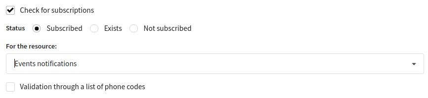
Check for subscriptions
At the moment of form submission, the platform will check if the profile of the person who filled out the form is subscribed to a specific resource. If a profile with the specified subscription does not exist, the user will not be able to submit the form.
When configuring the form, you need to select:
- the status you want to check (subscribed, exists, or not subscribed),
- the resource to check subscription for.
Form element display condition
You can show a form field to the user only if they gave a specific answer to the previous question. To do this, when configuring the element, click the Add condition button — additional fields will open (Under what conditions show the next hidden field).
Specify the condition and the value the user should select.
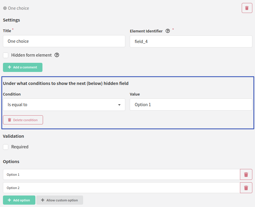
Next, add the element you want to show if the user selects a certain value in the question above. Activate the Hidden form element option:
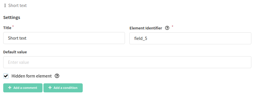
Now if the user selected a specific answer option, the hidden element will be shown to them. Otherwise, they will skip to the next question.
To add more complex conditions, such as transitioning between form pages depending on answers, configure the Logic block.
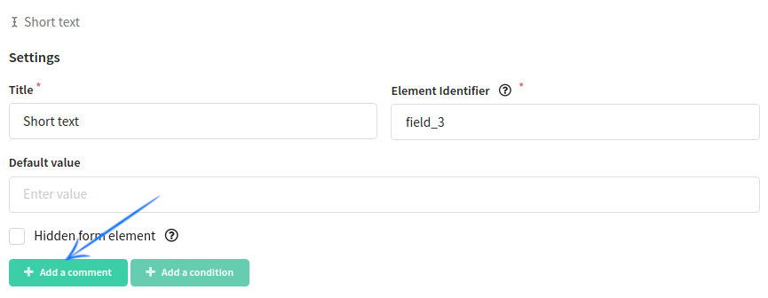
Comment
For each element, you can add a comment that will be displayed below the form field.
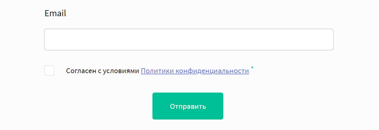
Links in form fields
You can add a link to any form element using HTML:
I agree to the <a target="_blank" href="#">Privacy Policy</a> terms
Form example
| Page 1 | Page 2 | Page 3 | Final page |
|---|---|---|---|
 |  | 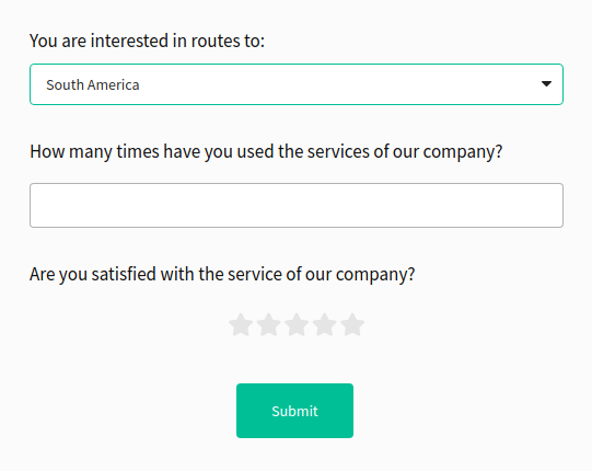 | 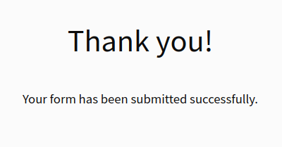 |
| Page 1 | Page 2 | Page 3 | Final page |
|---|---|---|---|
 |  |  | |
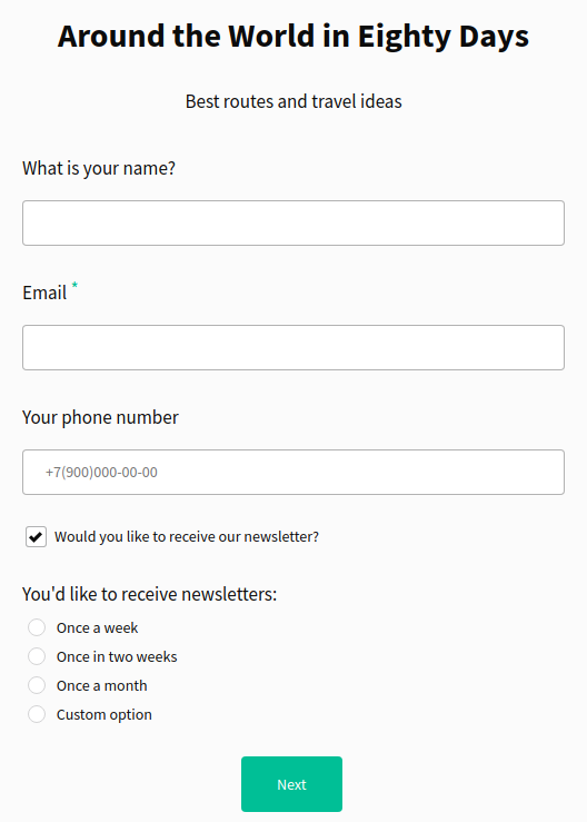
**Page 1 **
<Slider images={[{src: "/img/attachments/37848382/37848426.png"}, {src: "/img/attachments/37848382/37848432.png"}]}/>
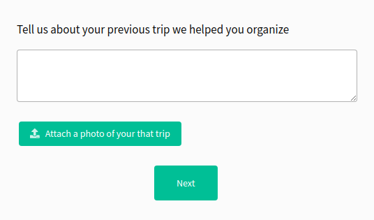
**Page 2**
<Slider images={[{src: "/img/attachments/37848206/37848248.png"}, {src: "/img/attachments/37848382/37848433.png"}]}/>
**Page 3**
<Slider images={[{src: "/img/attachments/37848382/37848428.png"}, {src: "/img/attachments/37848382/37848434.png"}]}/>
**Final page**
